
Eliza + Eliza Mono
What happens when the rigid logic of the pixel enters a humanist serif?
Context
What happens when the rigid logic of the pixel enters the humanistic construction of a serif typeface?
Approach
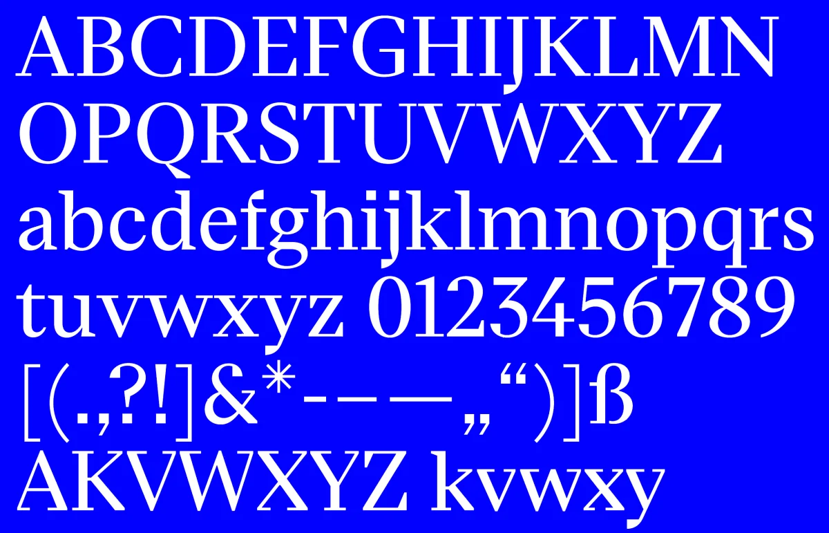
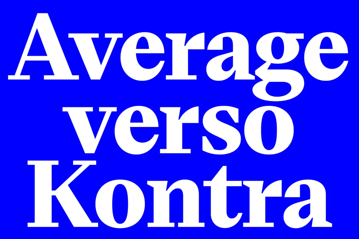
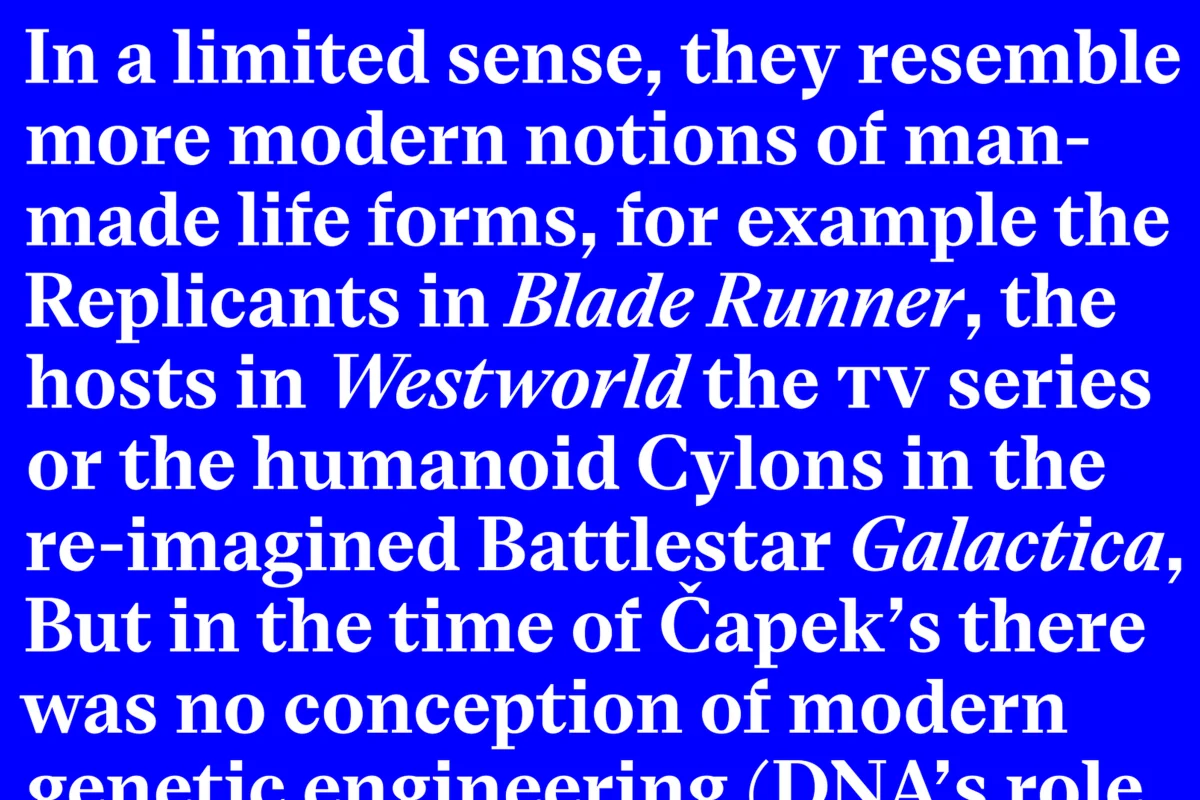
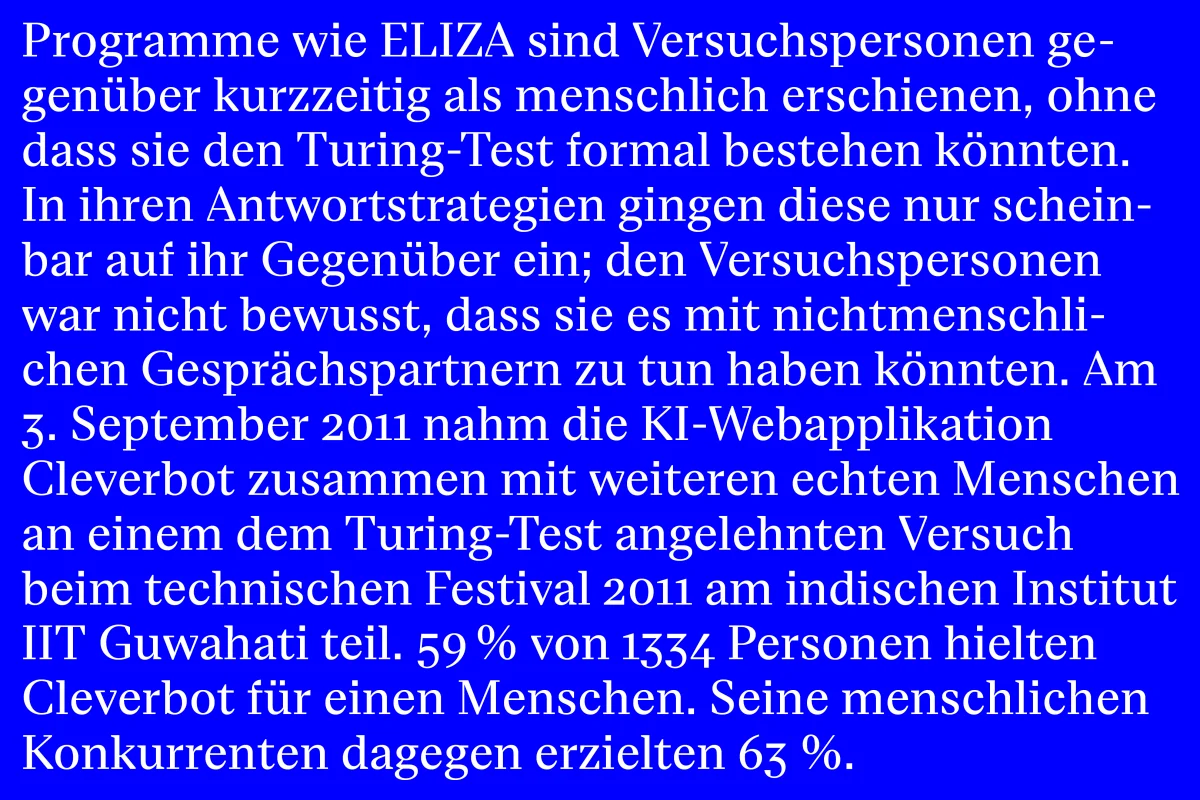
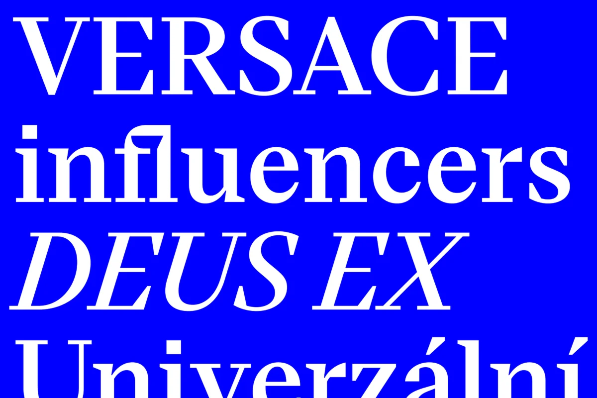
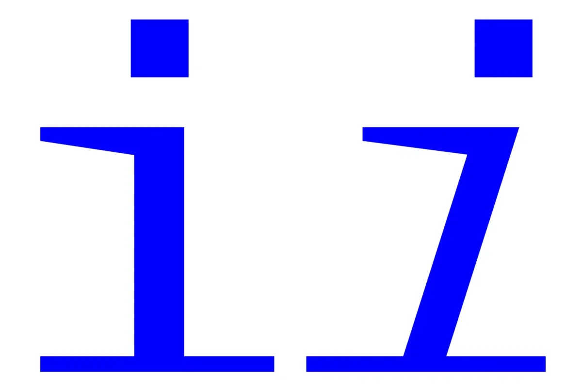
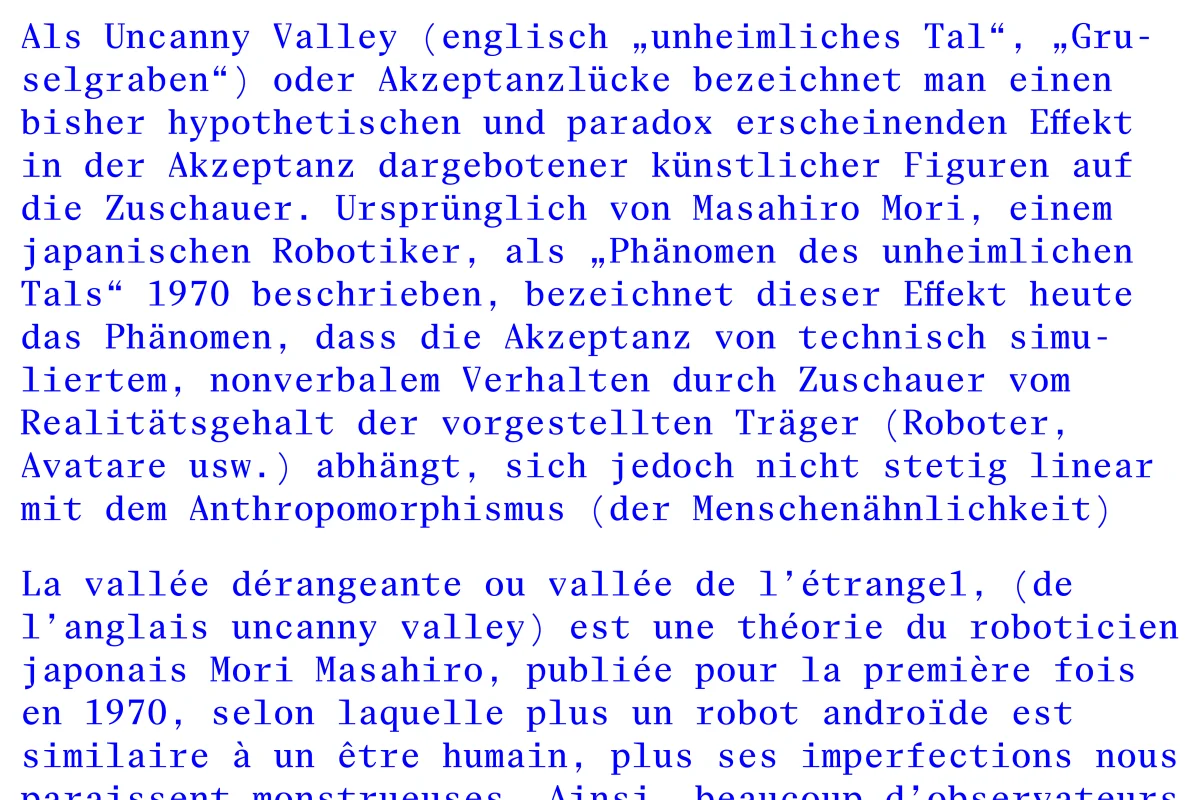
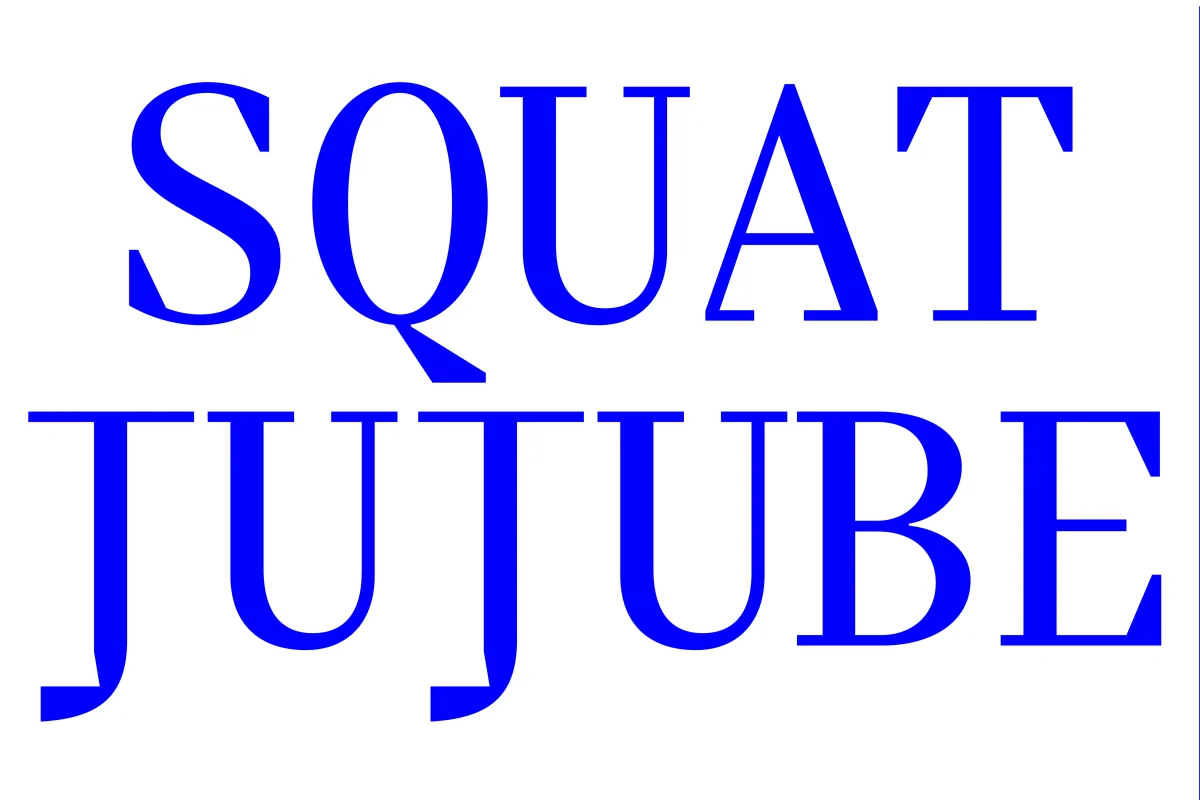
Eliza introduces the square as a recurring element into the familiar forms of a transitional serif. Curves meet angular interruptions, bringing two seemingly opposing qualities into the same letterforms: humanistic liveliness and digital rigidity.
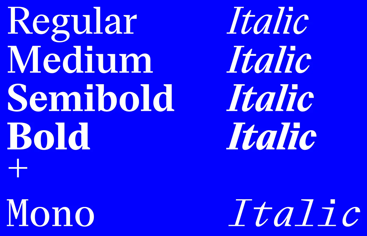
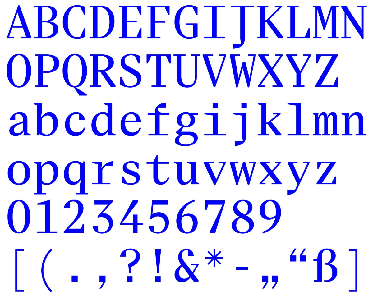
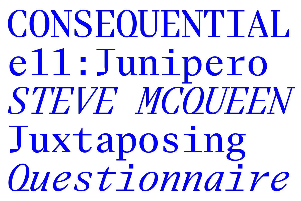
Stylistic sets allow individual characters to shift towards even more rigid constructions, making this tension adjustable within the typeface itself. Across four weights in roman and italic, the principle develops into a versatile family, accompanied by Eliza Mono, which translates the same idea into a monospaced structure.
Rather than choosing between human and machine, Eliza explores the space where their visual languages meet.
Project documentation






Project
Related Projects
-

ProtoPotsdam
-

String Quartet Biennale Amsterdam
-
Exilmuseum