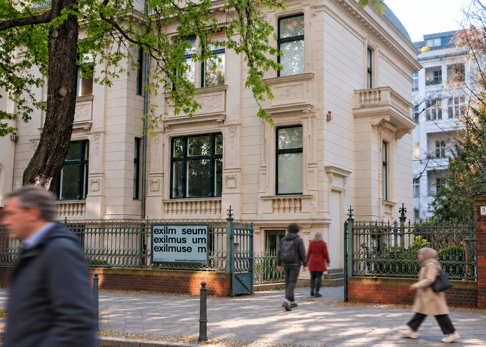
Street view of a pale historic villa behind a metal fence bearing Exilmuseum wordmarks, with several people walking past.

Exilmuseum

How does a place remember those who had to leave?

Context

The Exilmuseum Berlin connects the history of exile from 1933 to 1945 with the experiences and questions of the present. Personal stories offer perspectives on loss, belonging, and new beginnings. At its heart is the historic villa at Fasanenstraße 24, which is evolving into an open space for learning, encounter, and public dialogue. The museum operates on an interim basis ahead of its refurbishment and planned reopening in 2028. The task was to develop a visual identity for this transitional period, making the museum’s new direction visible while bringing together historical responsibility and a contemporary, accessible presence.

Approach

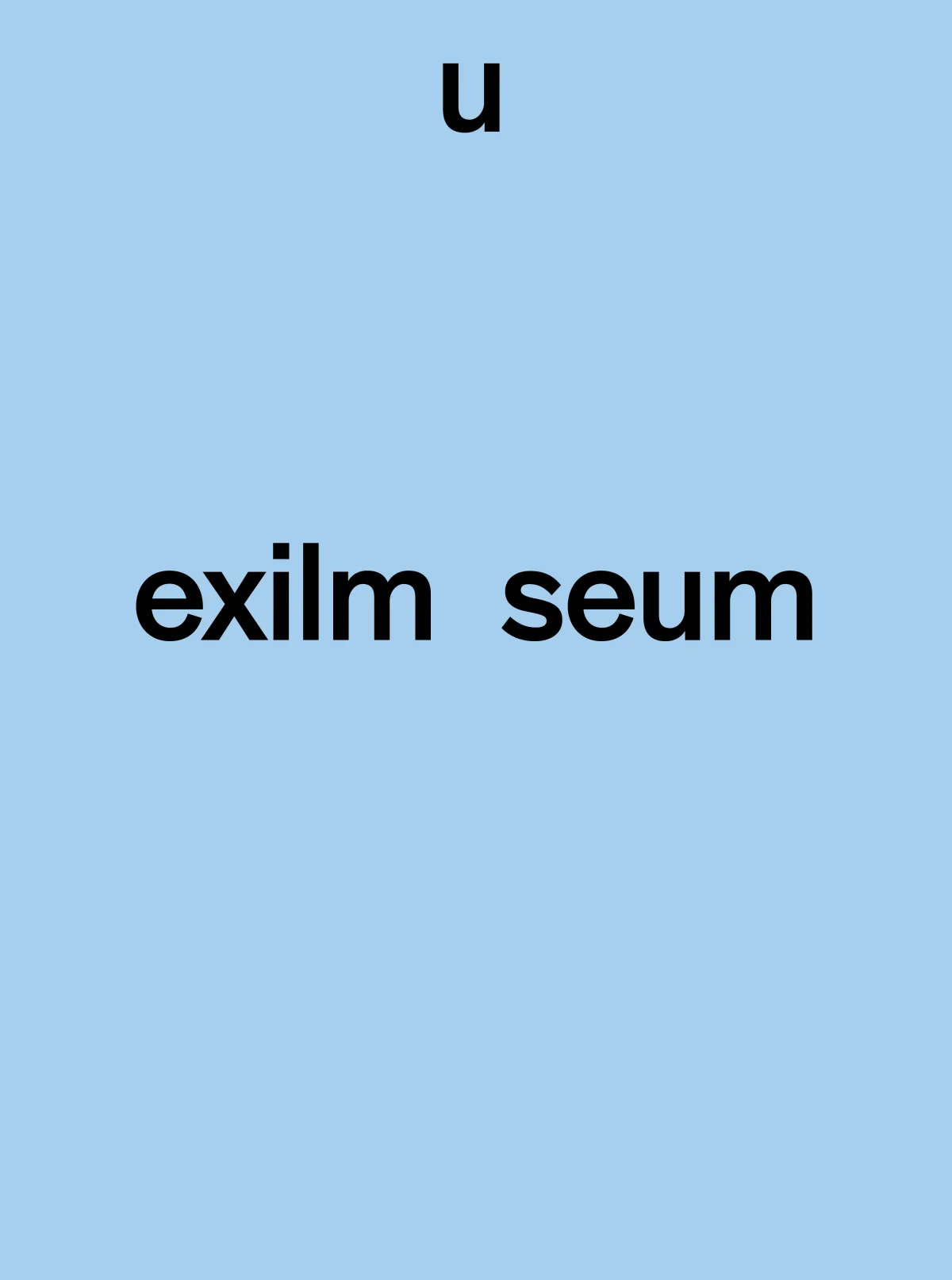
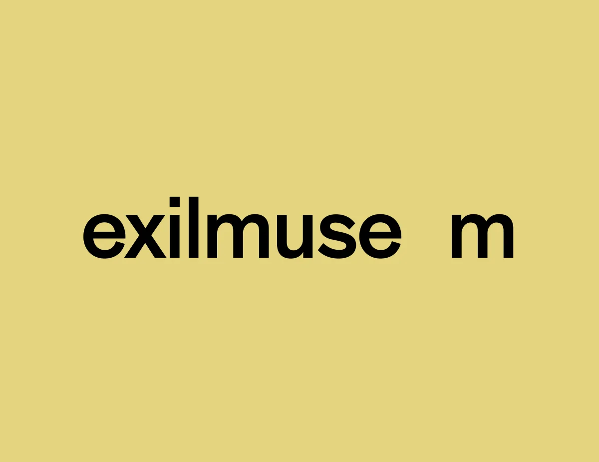
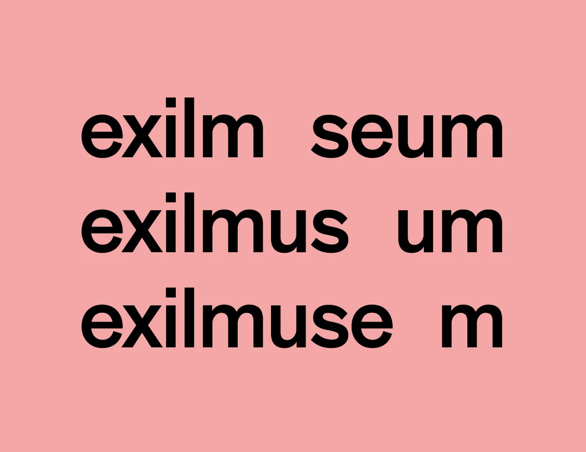
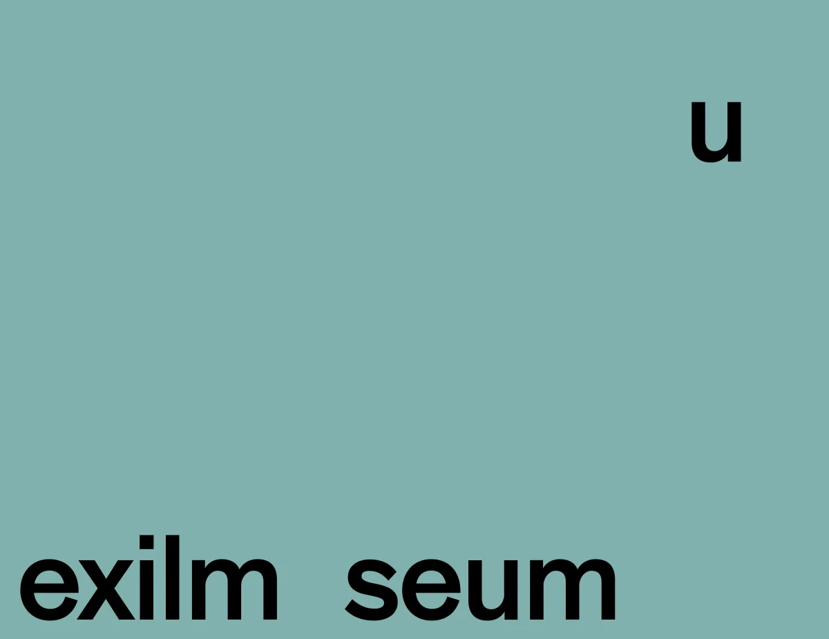
Through a three-part workshop with the museum team, we clarified its identity, audiences, and communication principles. The resulting design translates exile into a simple typographic movement: the “u” leaves its position in the wordmark, creating a gap. Absence and displacement become visible within the name itself. Clear sans-serif typography and a varied colour palette give the identity a direct, welcoming character. Conceived as a flexible system, it connects posters, spatial applications, and digital media.
At its heart is an approach to telling stories of exile that recognises people beyond their experiences of persecution. It gives space to their voices and the lives they led before and after displacement. History is understood as something that continues to shape our lives. The aim is to foster a culture of remembrance that embraces contemporary perspectives and invites us to learn from history for the present and the future.

Approval for the proposed wordmark was subsequently withdrawn. A revised brief prioritised maximum legibility while retaining absence as the underlying design concept.

Project documentation
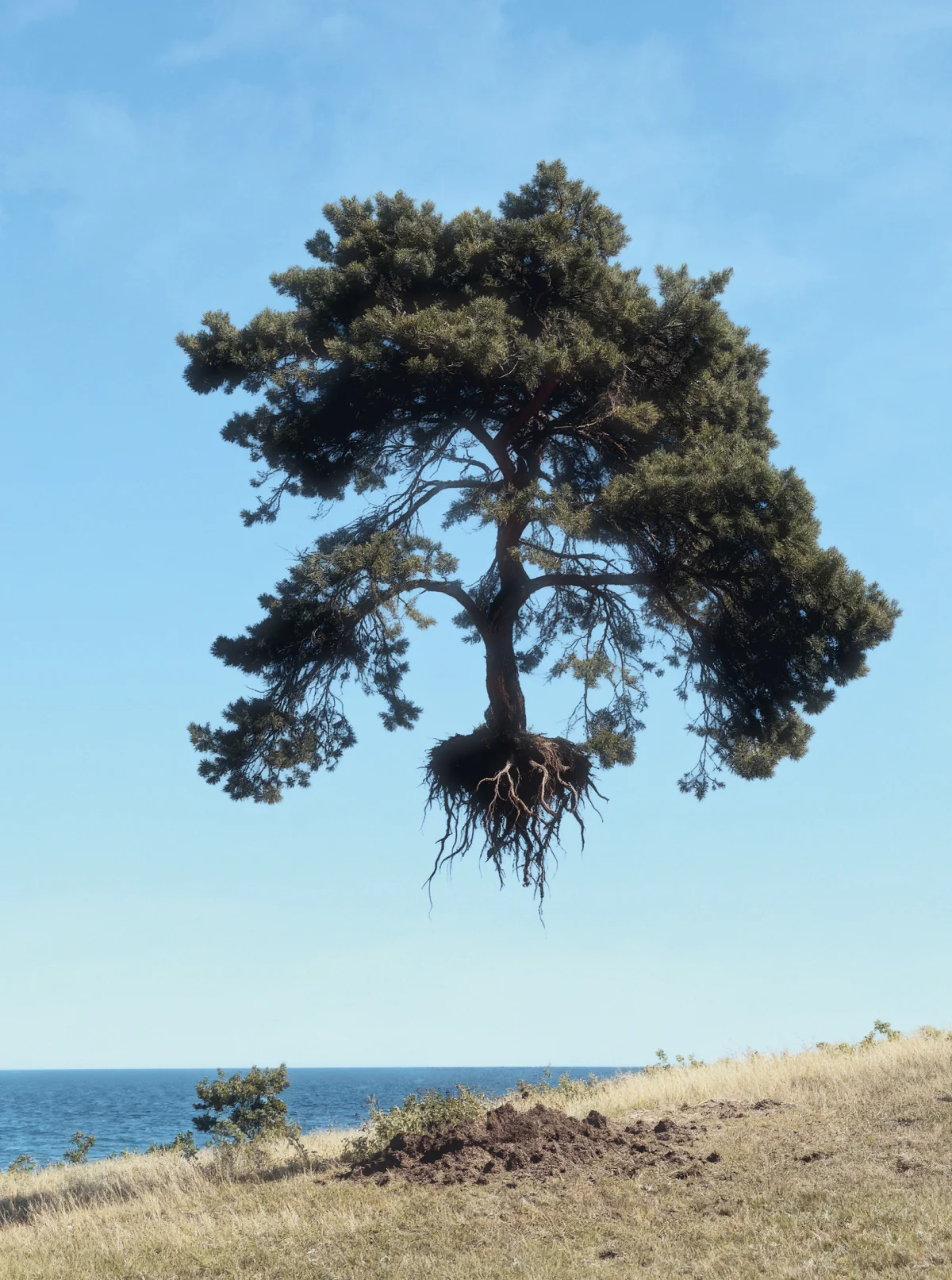
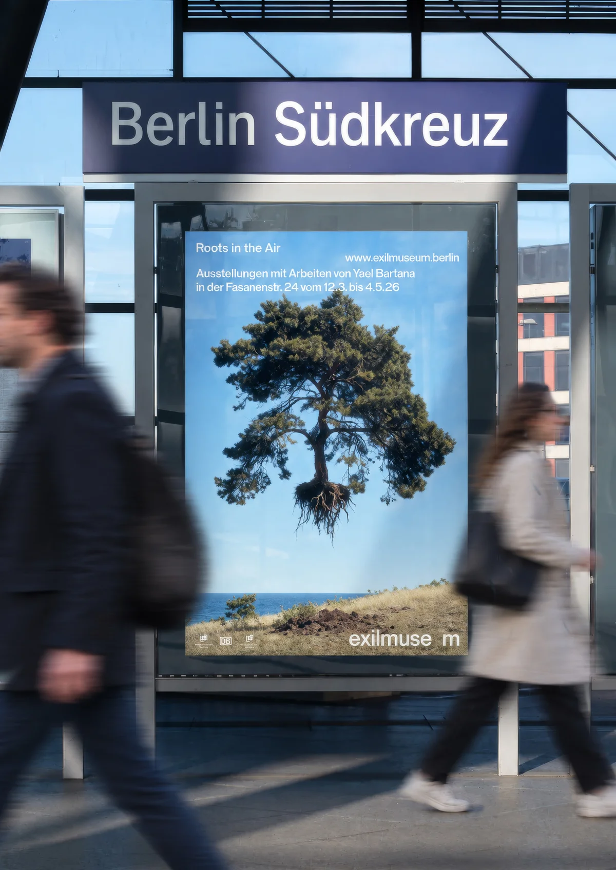
A tree with exposed roots floats above a grassy coastline, with blue sky and sea behind it.
Yael Bartana, “Exile”, 2025. The uprooted tree became a starting point for the visual identity and its exploration of displacement and absence.
Black Exilmuseum wordmark on pale blue, with the letter u positioned far above the remaining letters.
Black Exilmuseum wordmark on yellow, with a gap before the separated letter m.
Three black Exilmuseum wordmarks on pink, each with a different letter replaced by a gap.
Black Exilmuseum wordmark along the bottom of a turquoise panel, with the detached u in the upper right corner.
“Reform Grotesk Regular” type specimen with white uppercase and lowercase letters, numerals and symbols on black.
“Reform Grotesk Semi Extended” type specimen with white letters, numerals and symbols on black.
Colour palette of fifteen rectangular swatches in three rows, including turquoise, yellow, pink, green, orange and muted grey tones.
Colours of the in-between: deliberately ambiguous, muted tones that evoke a state between origin and arrival.
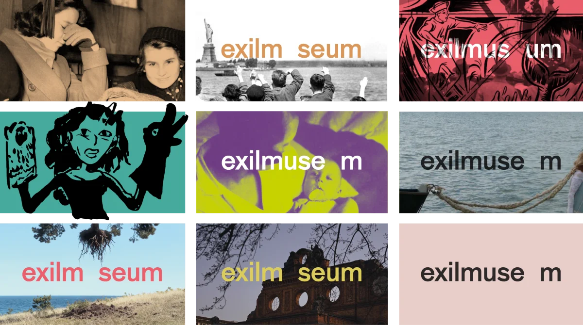
Nine examples of the Exilmuseum wordmark using different colours and letter gaps over photographs, illustrations and solid backgrounds.
White typography on black reading “Home is a question. Ausgewählte Texte von Thomas Mann 1933 bis 1945”.
Offset white lettering on black reading “Still here, elsewhere. Die Gegenwart Vertriebener. Schriftenreihe Exil”.
White typography on black announces “Roots in the Air”, featuring works by Yael Bartana, 12 March–4 May 2026, at Fasanenstraße 24.
White lettering on black reading “Exil als historische Erfahrung und politische Gegenwart” — exile as historical experience and political present.
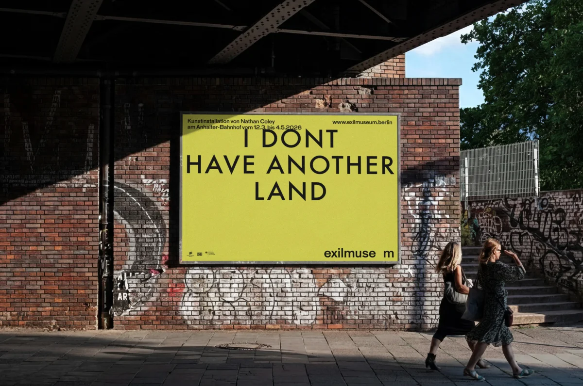
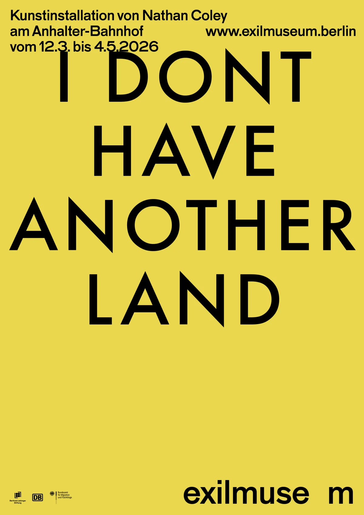
Yellow Exilmuseum poster reading “I DON'T HAVE ANOTHER LAND” on a graffiti-covered brick wall beneath a bridge.
Yellow poster with black “I DON'T HAVE ANOTHER LAND” lettering, an announcement for Nathan Coley’s art installation and the Exilmuseum wordmark.
People walk past an advertising display at Berlin Südkreuz station, where a blue Exilmuseum poster shows a floating tree.
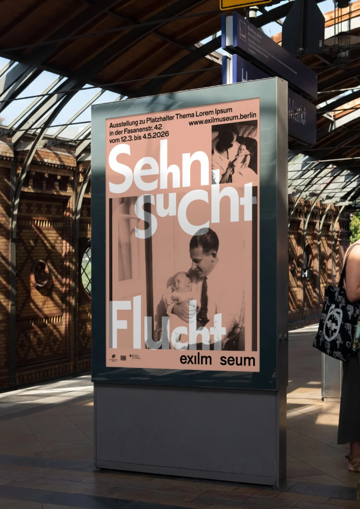
Advertising display at a station with a pink Exilmuseum poster, historical portraits and large white “Sehnsucht” and “Flucht” lettering.
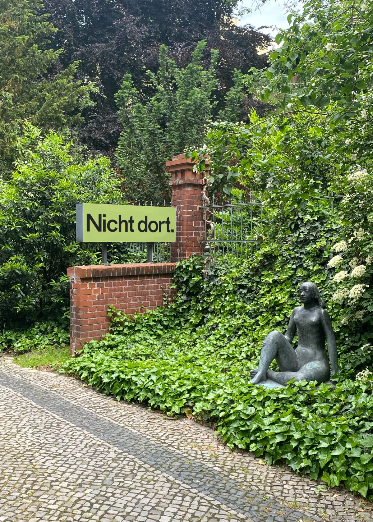
Yellow-green sign reading “Nicht dort.” on a brick wall in a planted garden beside a seated bronze sculpture.
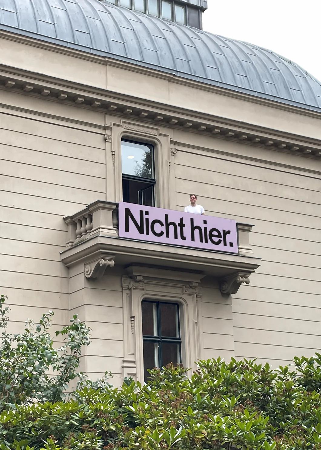
Pink banner reading “Nicht hier.” on the balcony of a pale historic building, with a person standing behind it.
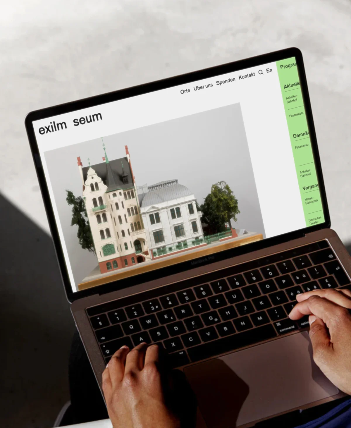
Hands operate a laptop displaying the Exilmuseum website, with an image of an architectural model and a green programme column.
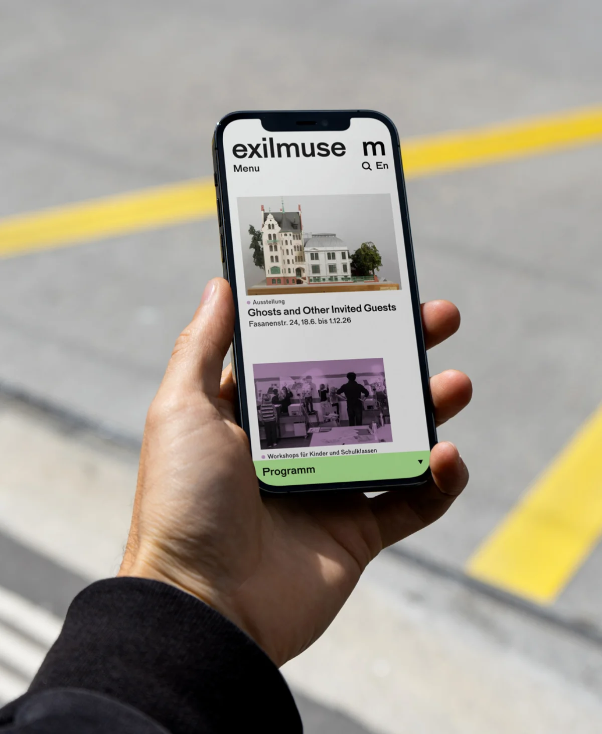
A hand holds a smartphone displaying the Exilmuseum website, an architectural model, an exhibition preview and a green programme bar.
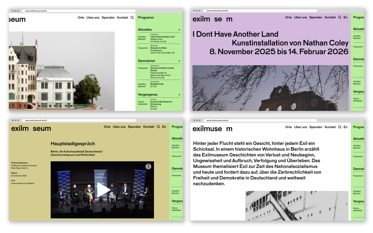
Four desktop views of the Exilmuseum website showing an architectural model, exhibition announcement, event video and introductory text, with a green programme column.
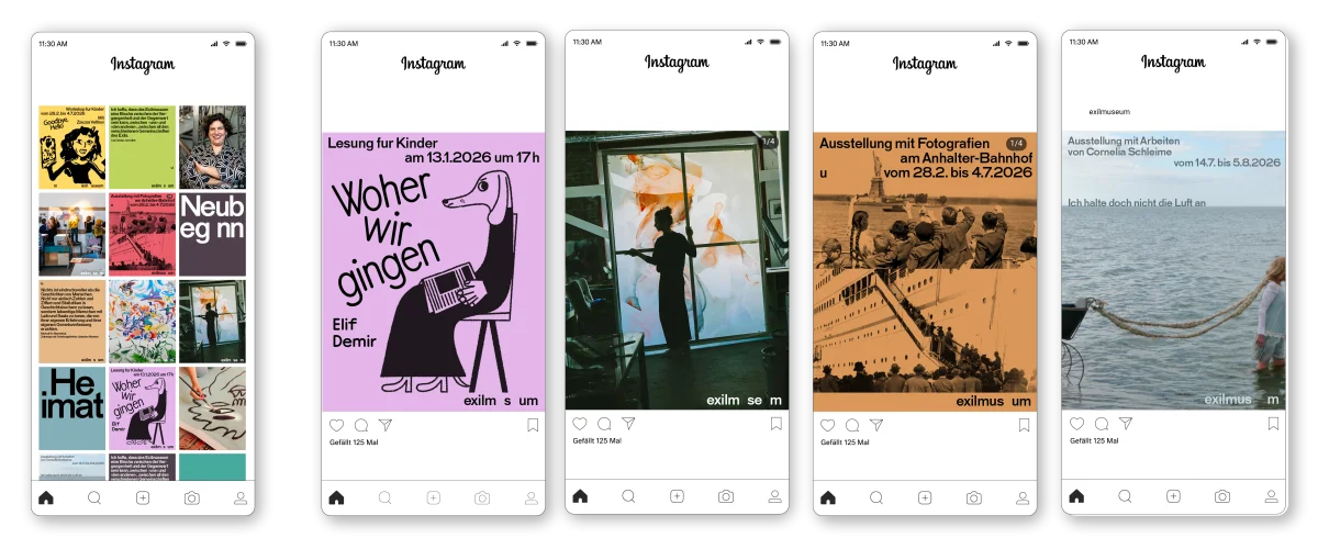
Five smartphone views of Exilmuseum’s Instagram presence, showing a post grid and colourful event announcements.
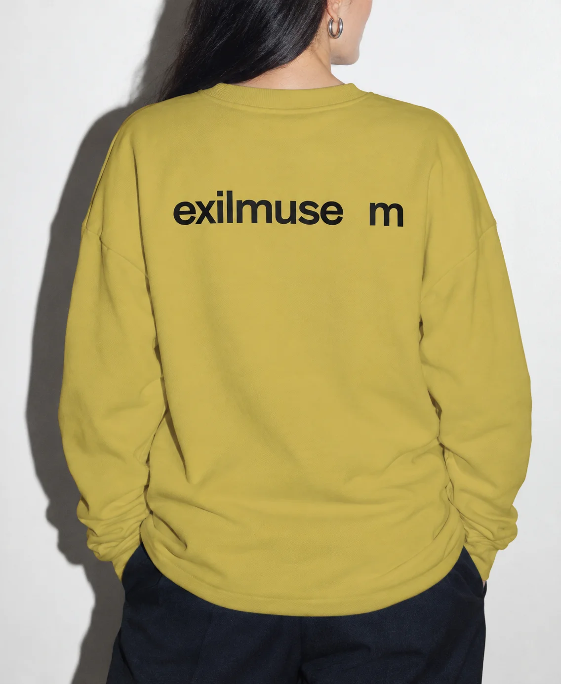
Back view of a person wearing a yellow-green sweatshirt with a black Exilmuseum wordmark and a gap before the m.
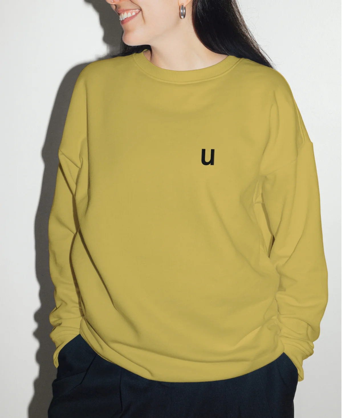
Front view of the yellow-green sweatshirt with a single black u on the chest.
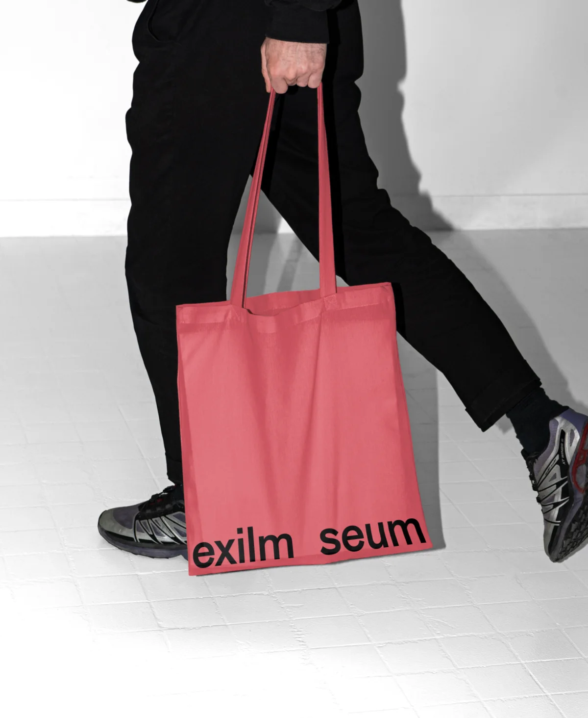
A walking person carries a coral-red tote bag with a black Exilmuseum wordmark along the bottom edge.
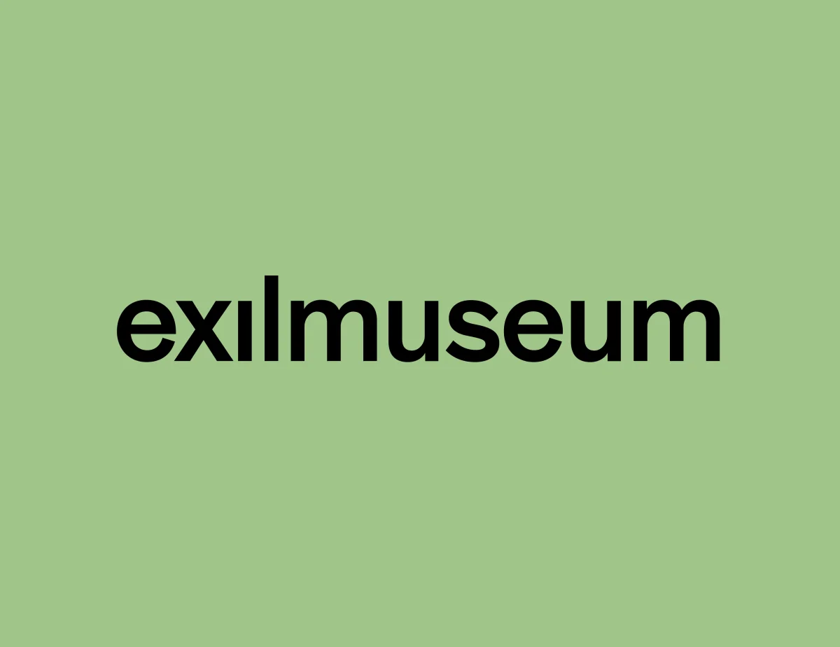
Complete black “exilmuseum” wordmark centred on a pale green background.
After approval for the original design was withdrawn, a revised brief called for maximum legibility while retaining the underlying concept of absence. The revised wordmark shifts this idea to a subtle detail: the dot above the “i” is missing, while the name remains fully legible. The other elements of the visual identity were retained.

Project

Project Title
Exilmuseum
Client
Exilmuseum
Year
2026
Services
Strategic Positioning, Identity Design, Website Design
Role
Concept, Art Direction, Design Development
Graphic Design
Sarah Fricke, Pawel Wolowitsch (Arbeitsgruppe Informationsdesign)
Design and Concept Advisor
Matthias Görlich (Arbeitsgruppe Informationsdesign)
Website Development
Menschmaschine Studio