Five black P variants combining outlines and filled shapes in different ways on orange.
Vertically stacked “Proto” wordmarks with alternating outlined and solid letters on orange.

ProtoPotsdam

How can design represent a future that is still being formed?

Context

How do you create an identity for something whose final form does not yet exist? Initiated by Bauhaus Earth, ProtoPotsdam was conceived as an open research project exploring circular and sustainable ways of building. At its centre was a pavilion in Potsdam that would itself develop through this process, rather than follow a predetermined form.

Approach

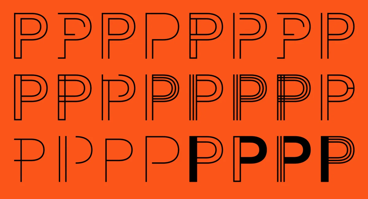
The identity takes this state of becoming as its starting point. The word “Proto” appears in different combinations of outlines and filled forms, moving between proposition and definition, between an open framework and something taking shape. Instead of settling on a single expression, the typography can transform as the project develops.
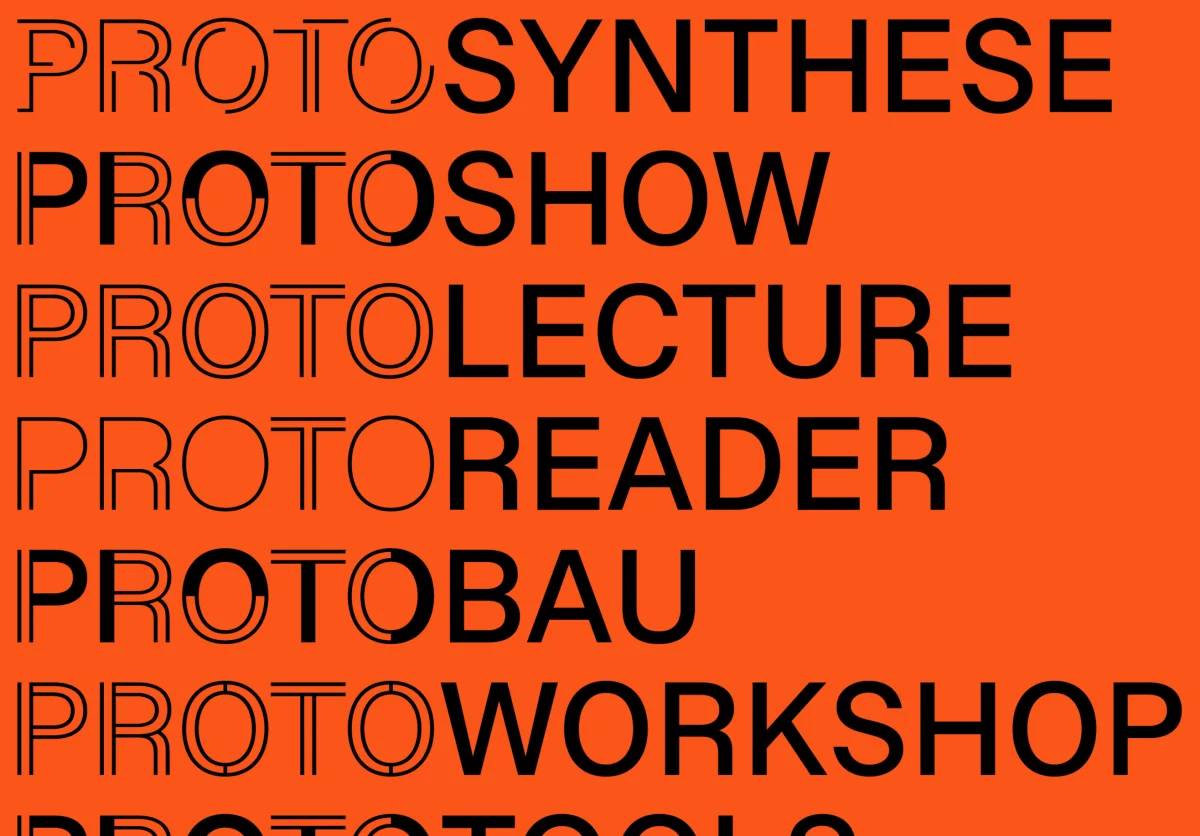
This principle extends into a flexible system for talks, workshops and other formats. Each can take on a different typographic expression, while together they form an evolving identity that reflects ProtoPotsdam as a process of searching, testing and transformation.

Project documentation
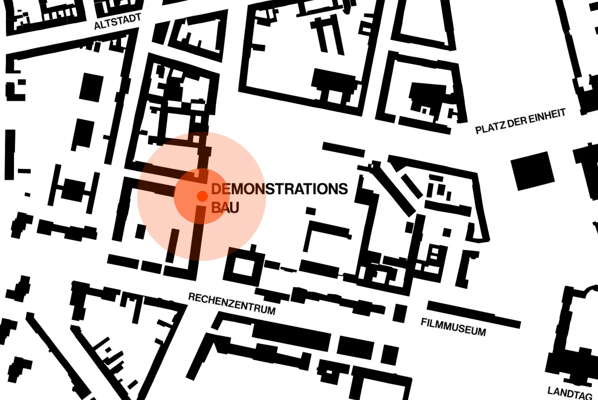
Black-and-white map of Potsdam with an orange marker highlighting the demonstration building.
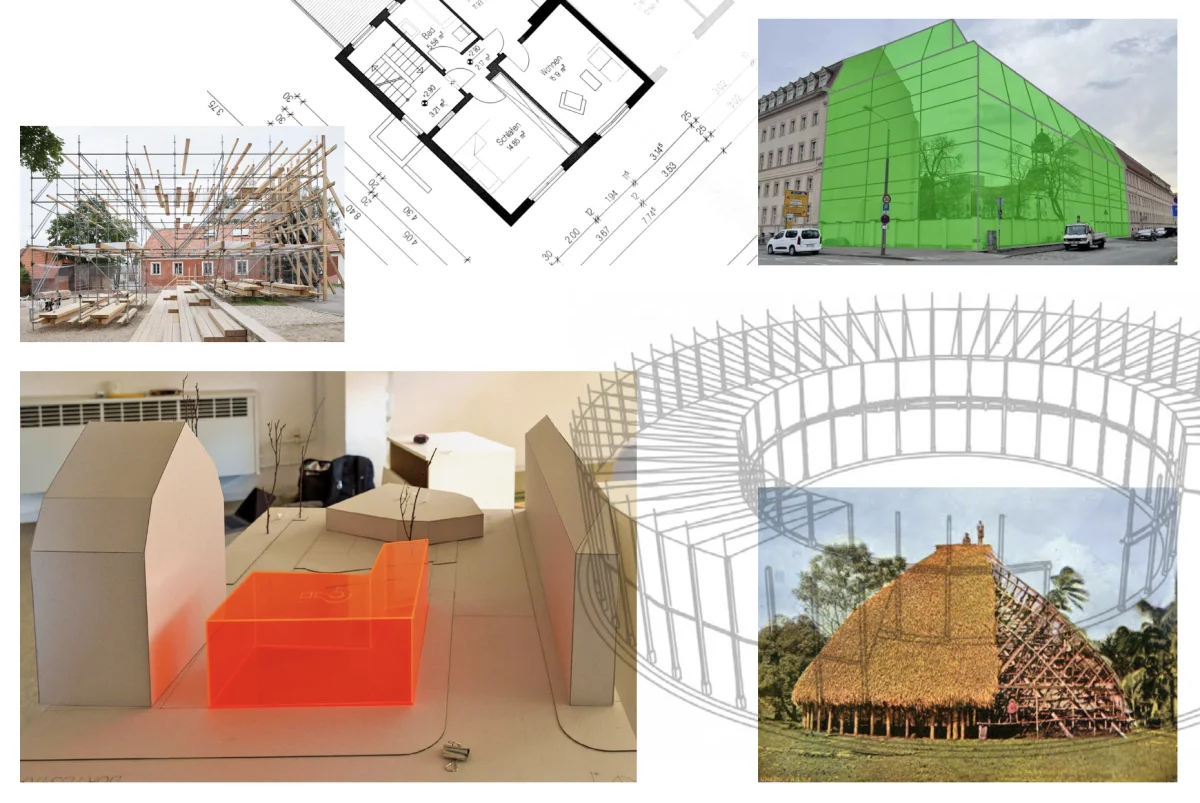
Collection of plans, architectural models, construction photographs and a green facade rendering for ProtoPotsdam.
Grid of black P variants on orange, combining outlines, filled shapes and different line arrangements.
Black Proto wordmarks on orange, including “ProtoSynthese”, “ProtoShow”, “ProtoLecture”, “ProtoReader”, “ProtoBau” and “ProtoWorkshop”.
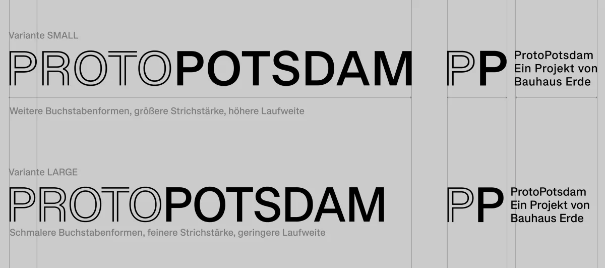
Comparison of small and large ProtoPotsdam wordmarks and PP monograms on grey.
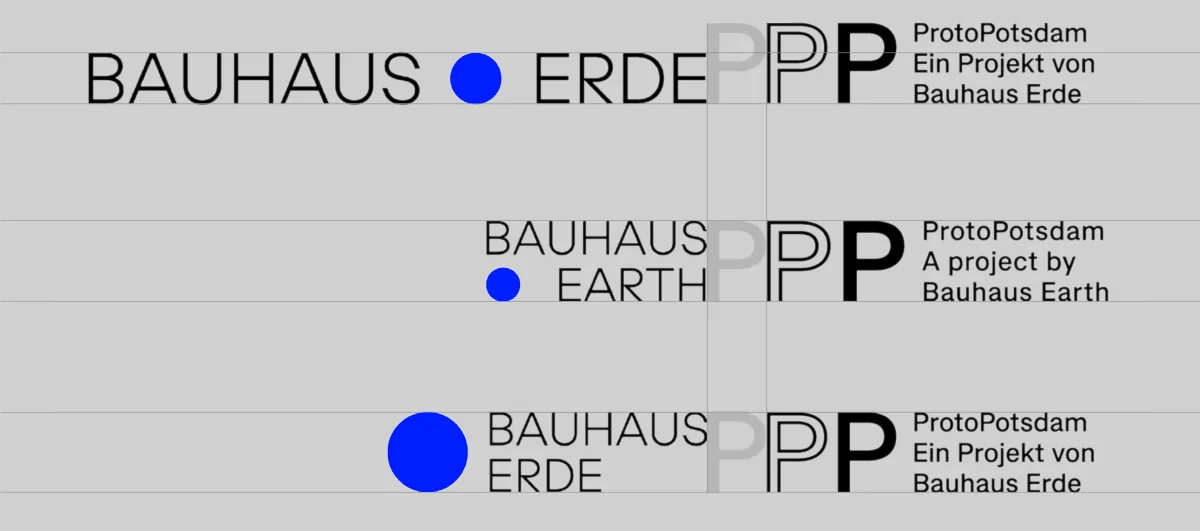
Combinations of the Bauhaus Earth wordmark and blue circle with the ProtoPotsdam PP symbol.
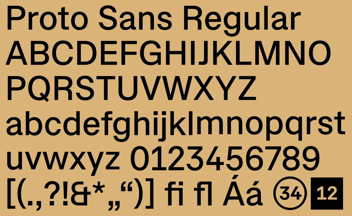
Proto Sans Regular showing uppercase and lowercase letters, numbers, punctuation and ligatures in black on ochre.
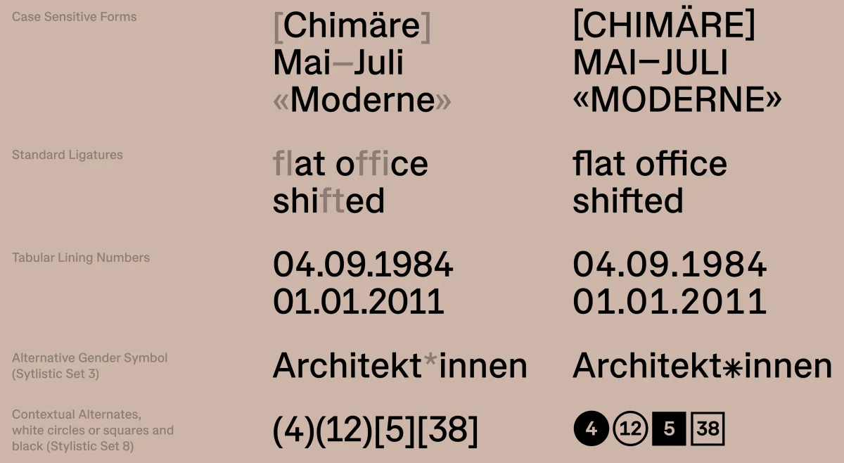
Proto Sans feature overview with ligatures, numeral styles, case-sensitive punctuation and alternate characters.
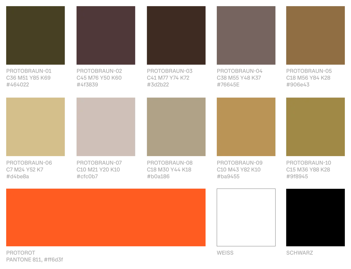
ProtoPotsdam colour palette with ten brown and beige tones, vivid orange, white and black.
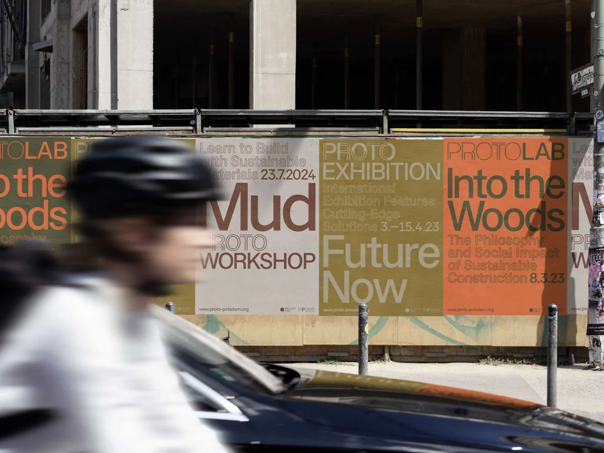
ProtoPotsdam poster series with large event titles on a construction fence, with a cyclist passing in the foreground.
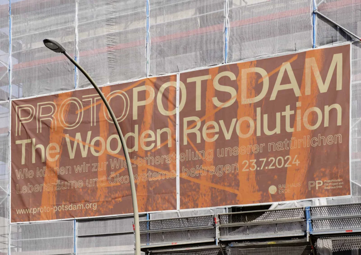
Large orange-brown construction banner reading “ProtoPotsdam – The Wooden Revolution” on a scaffolded facade.
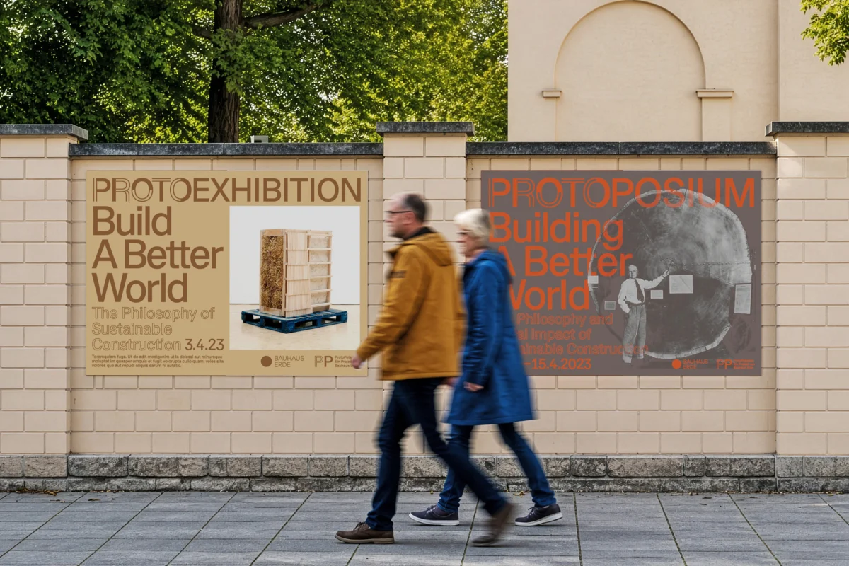
Two ProtoPotsdam “Build a Better World” posters on a wall, with two people walking past.
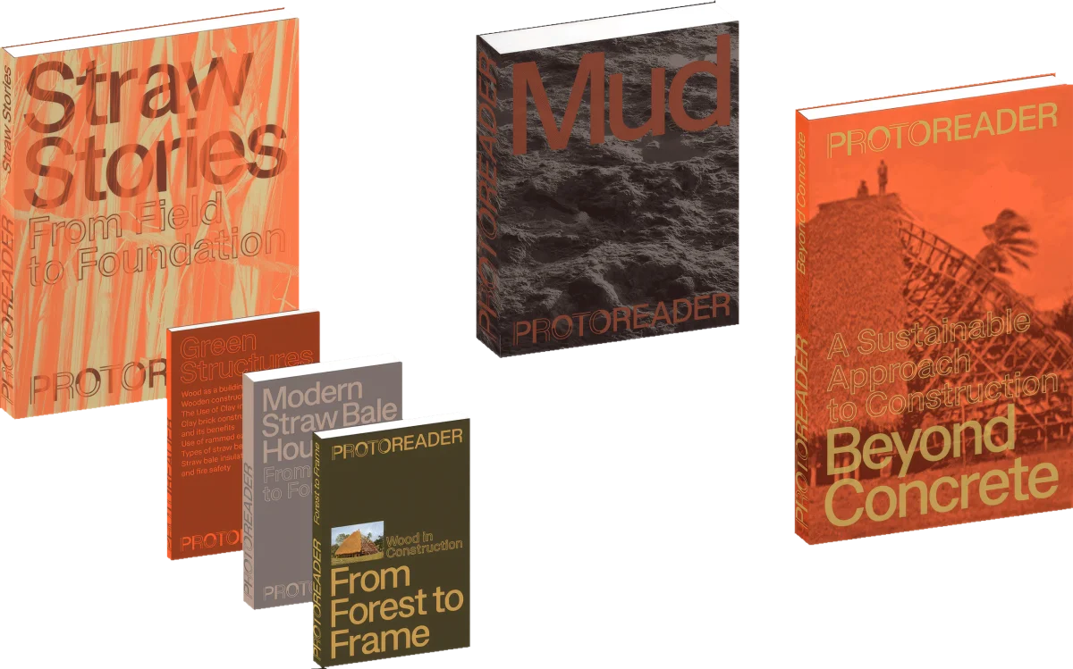
ProtoReader publications in orange, brown and grey, with large titles and images of natural building materials.
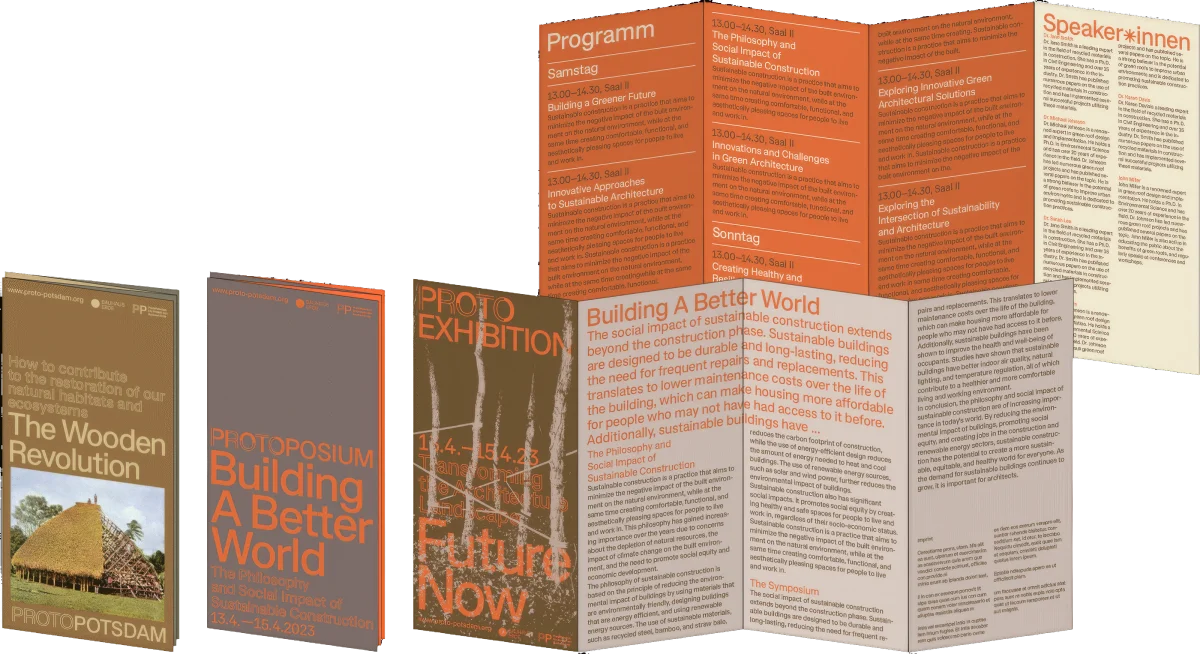
Several ProtoPotsdam leaflets with orange-brown covers and an unfolded programme with text columns.
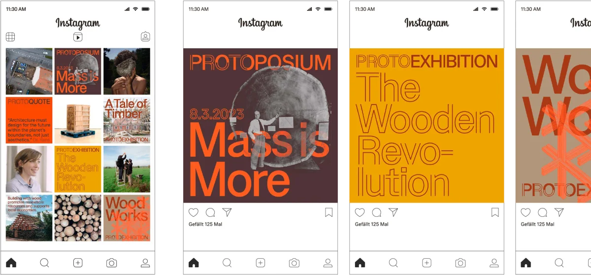
ProtoPotsdam Instagram screens with large typography, coloured panels and architectural imagery.

Project

Project Title
ProtoPotsdam
Client
ProtoPotsdam by Bauhaus Earth
Year
2022
Services
Identity Design, Website Design, Type Design
Role
Concept Development, Art Direction, Design
Graphic Design
Sarah Fricke, Lea Sievertsen, Pawel Wolowitsch (Distaff Studio)
Website Development
Menschmaschine Studio
Typeface
Proto Sans by Pawel Wolowitsch