Upright “Specology” volume with an orange cover, white title and blue spiral binding on a reflective surface.
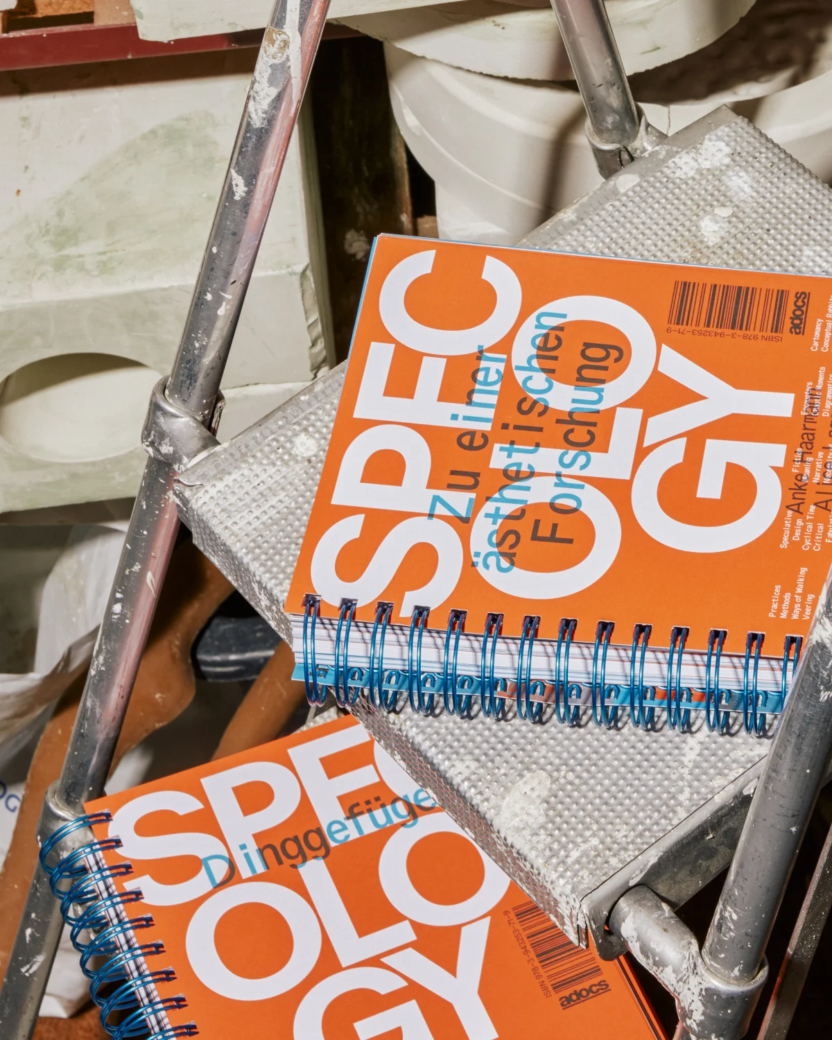
Orange “Specology” volume with blue spiral binding standing on a worn metal stepladder.

Specology. On an Aesthetic Research

How can a publication transform research into a space of exploration?

Context

Exploring the possibilities and challenges of speculative aesthetic research means bringing together different ways of thinking and making. Drawing on perspectives from art, design, philosophy, cultural theory and beyond academia, the project emerged from more than three years of research, conversations and experimentation.
How can a publication about research allow its readers to find their own way through it rather than prescribing where to begin and where to end?

Approach

Each chapter is designed as a book of its own, beginning with the same cover and connected to the others through a continuous spiral binding. There is no definitive front or back, no single beginning or end. Instead of following a fixed sequence, readers can enter the publication from different points.
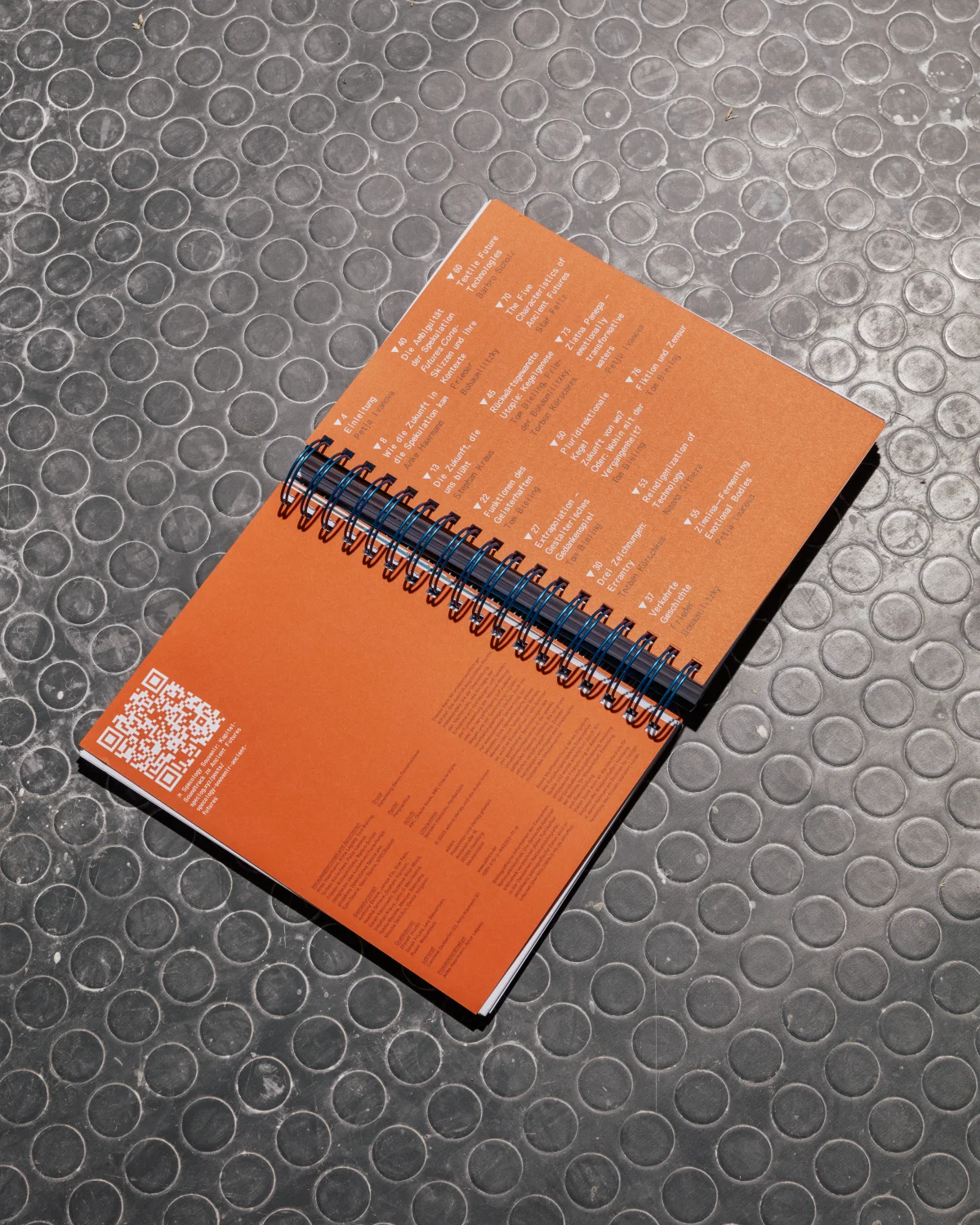
At the beginning of each chapter, an index of keywords and references creates connections across the book. Following these links means moving forwards and backwards between subjects, texts and chapters, according to one's own interests and associations.
The publication becomes a tool for research itself: not a linear argument to follow from beginning to end, but a structure to navigate, revisit and explore.

Project documentation
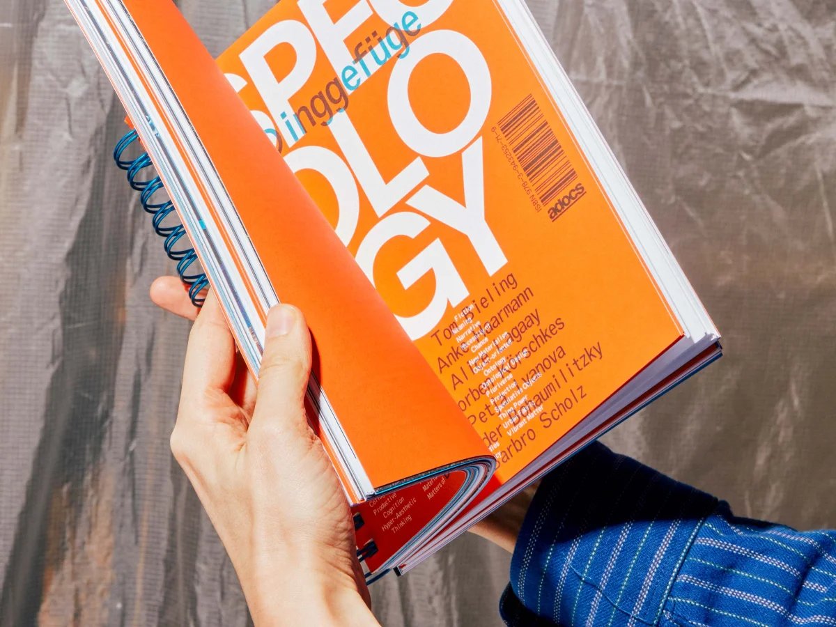
Hands holding “Specology”, with an orange cover, large white typography and blue spiral binding.
Two orange “Specology” volumes on a metal stepladder, with blue spiral binding connecting the chapters.
Opened orange back-cover panels of “Specology”, with index text, a QR code and central spiral binding.
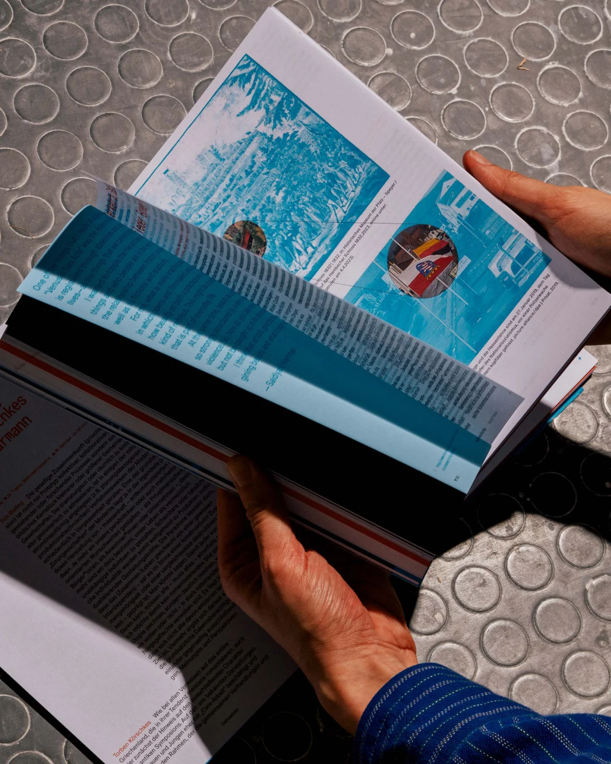
Hands turning a “Specology” spread featuring turquoise-toned images.
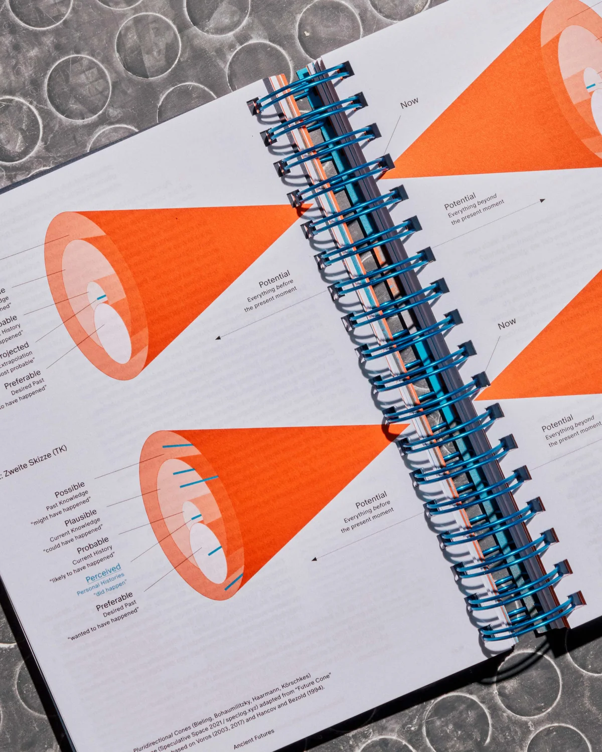
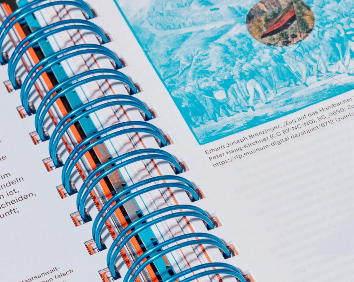
Close-up of blue spiral binding between pages with orange section markers and index text.
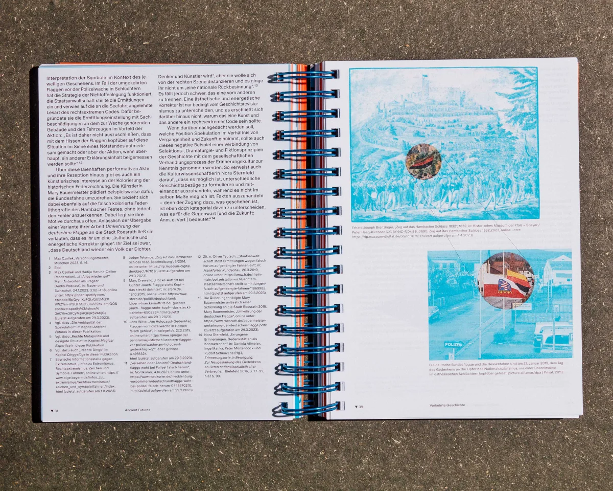
“Specology” spread with multi-column text on the left and turquoise image montages on the right.
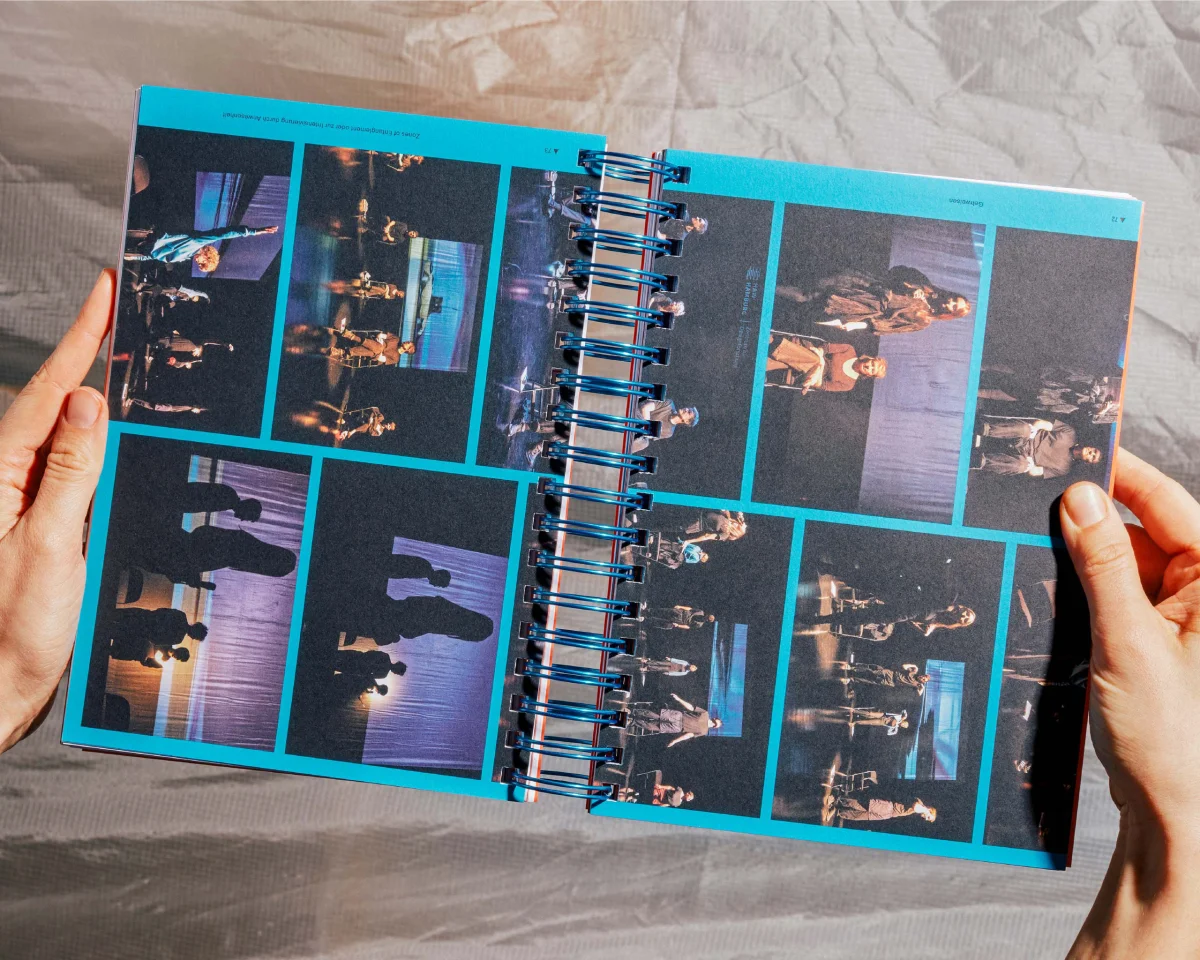
Open “Specology” volume with a sequence of stage photographs framed in turquoise.
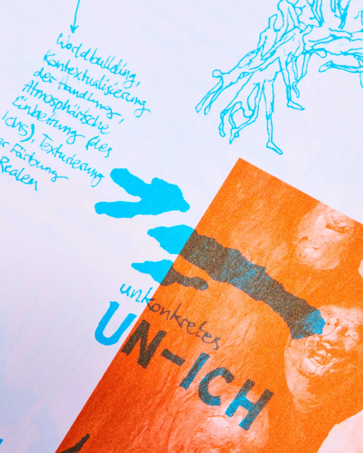
Detail of a “Specology” page with turquoise handwriting, an orange collage and the word “Un-Ich”.
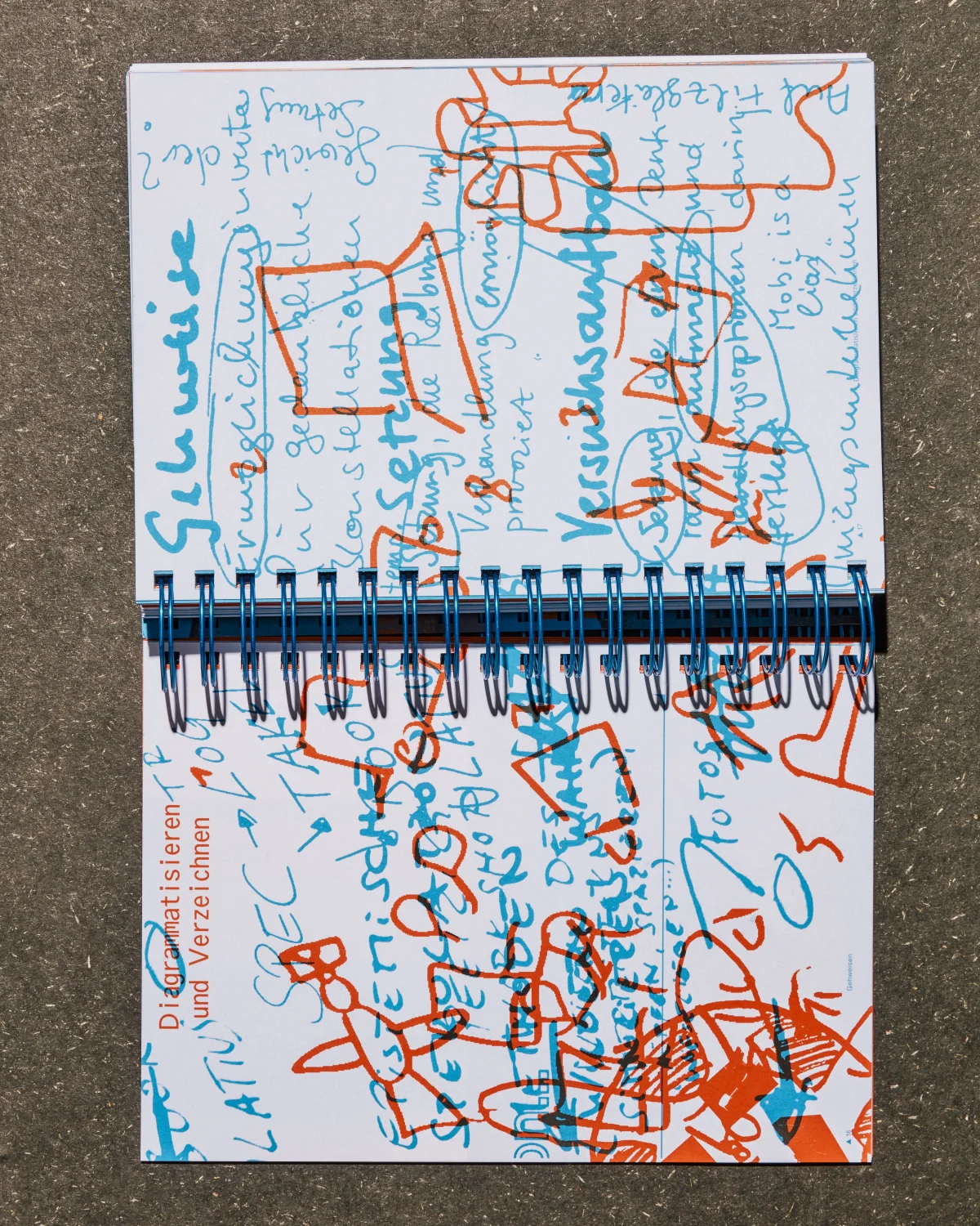
The entire book is printed in two spot colors, enabling the creation of overlays that intertwine content and weave new narratives.
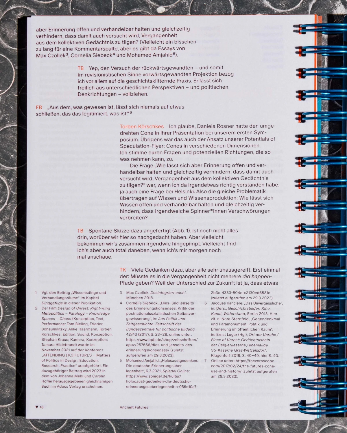
“Specology” text page with conversational passages, orange highlights and a dense footnote section.
Even the text layer was produced through overprinting the two spot colors, making this approach not only a visual gesture but also a cost-efficient solution.
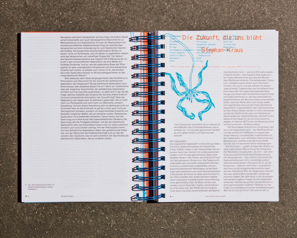
“Specology” spread titled “Die Zukunft, die uns blüht”, with an orange heading and a turquoise plant drawing.
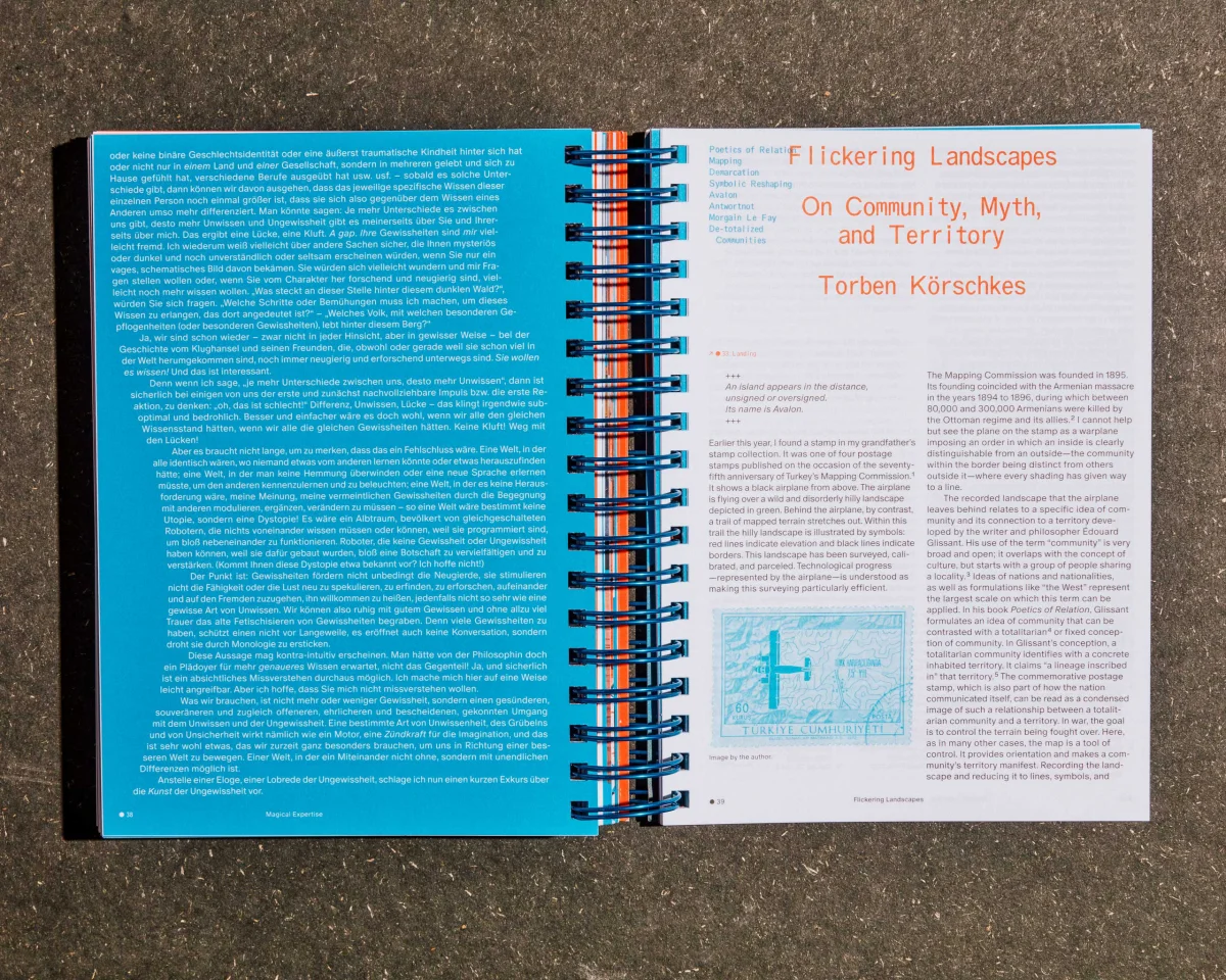
“Specology” spread titled “Flickering Landscapes”, with white text on turquoise on the left and an orange heading on the right.
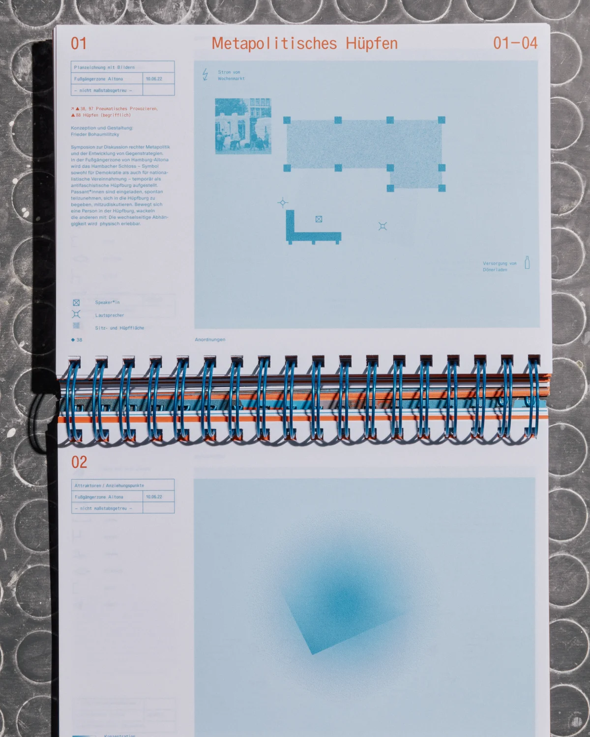
Open “Specology” volume with two chapter openings, pale blue graphics and horizontally running spiral binding.
“Specology” spread with overlapping turquoise handwritten notes and orange drawings.
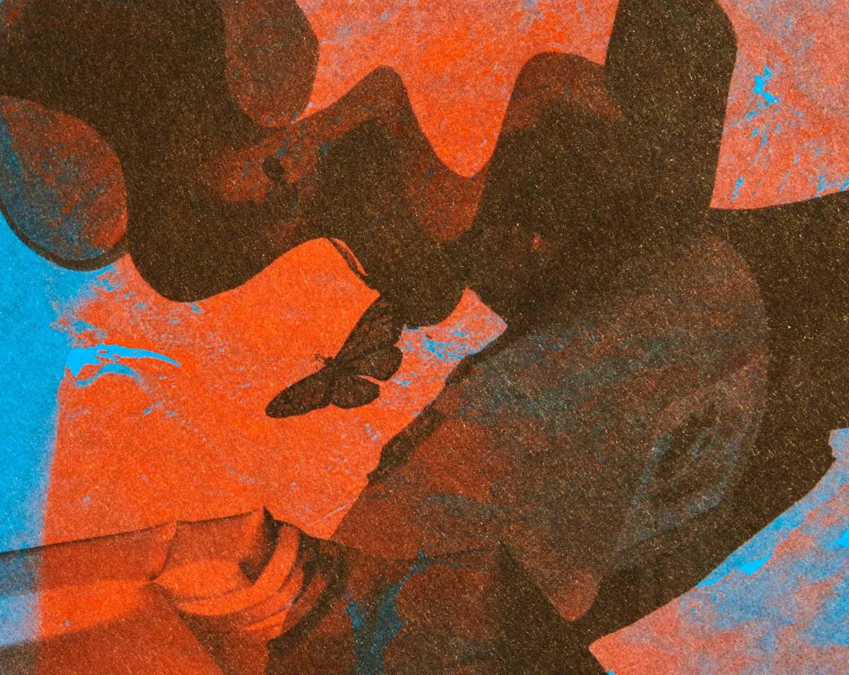
Close-up of a grainy orange, black and turquoise image collage in “Specology”.
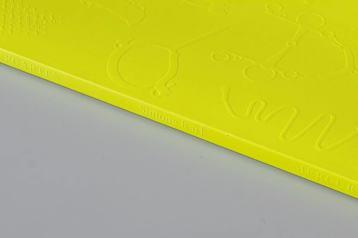
Side view of the “Specology” book block, with closely layered white, turquoise and orange pages.
Detail of blue spiral binding beside a turquoise image and a small caption.
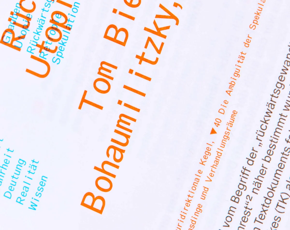
Typographic detail from “Specology”, with orange names and turquoise index terms on white.

Project

Project Title
Specology. On an Aesthetic Research
Client
SpecSpace, Hamburg University of Applied Sciences
Year
2023
Services
Editorial Design
Role
Concept Development, Design
Graphic Design
Sarah Fricke, Lea Sievertsen, Pawel Wolowitsch (Distaff Studio)
Editors
Anke Haarmann, Alice Lagaay, Tom Bieling, Torben Körschkes, Petja Ivanova, Frieder Bohaumilitzky, Barbro Scholz (SpecSpace)
Publisher
adocs
Image Credits
Luisa Hanika
Typeface
Oracle by Dinamo Typefaces