Red String Quartet Biennale poster with hand imagery in an advertising display beside the water in Amsterdam.
Portrait-format crop of an advertising display with a red Biennale poster beside Amsterdam’s waterfront.

String Quartet Biennale Amsterdam

How much of music can be seen before it is heard?

Context

The String Quartet Biennale Amsterdam brings together international ensembles and new perspectives on one of classical music’s most enduring forms.

Approach

The identity shifts attention from the historical image of chamber music towards the physical gestures and interactions that shape a performance.
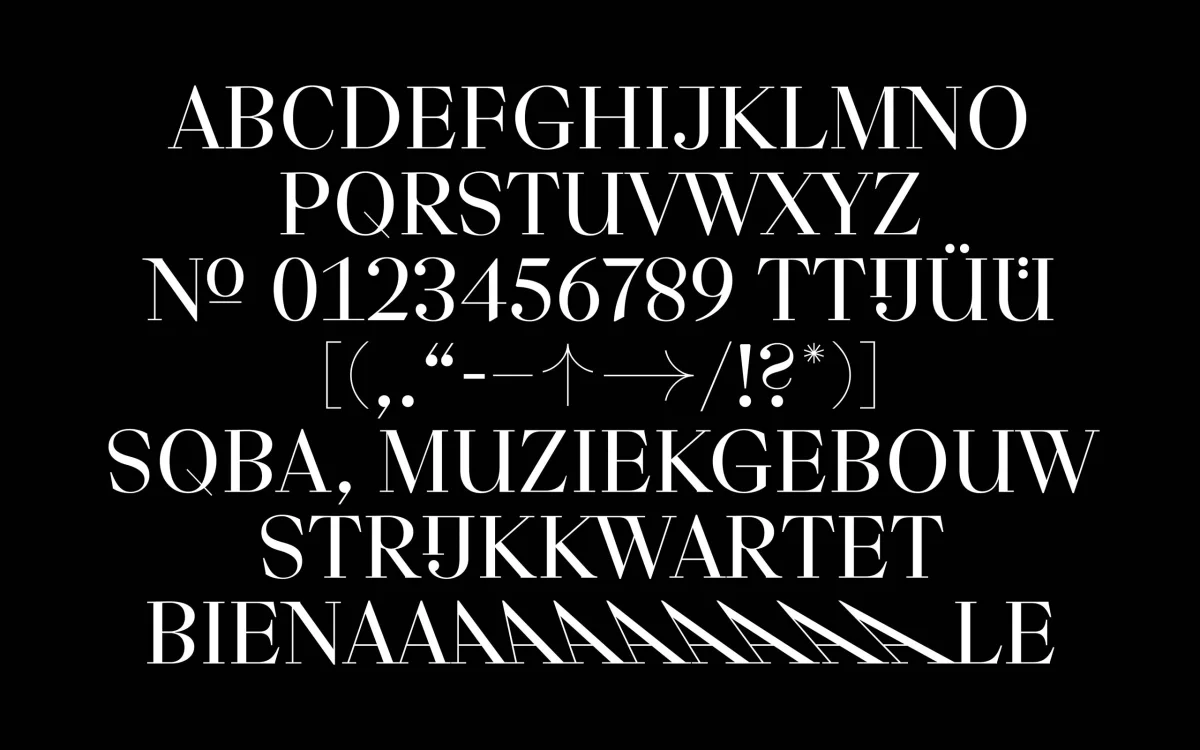
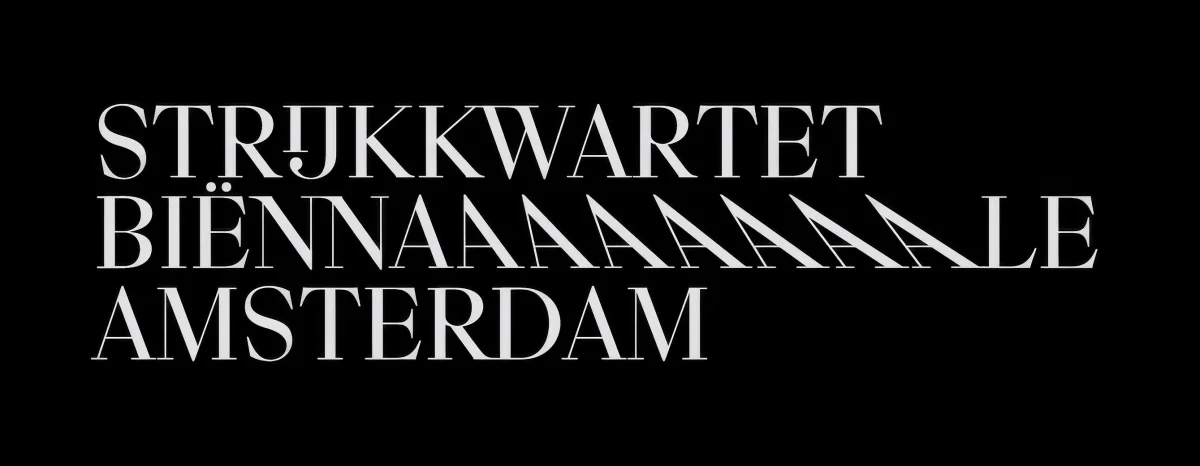
A custom display typeface translates the characteristic movements of string quartet playing into visual form. Bow movements, hand positions and the shifting dynamics between four musicians become the basis for a system of expressive letterforms. Each character captures a different gesture, turning the typography itself into a record of musical movement.
Applied across posters, digital media and motion, the identity transforms the energy of performance into a visual language. The festival is presented not as a static tradition, but as a living practice defined by rhythm, interaction and exchange.

Project documentation
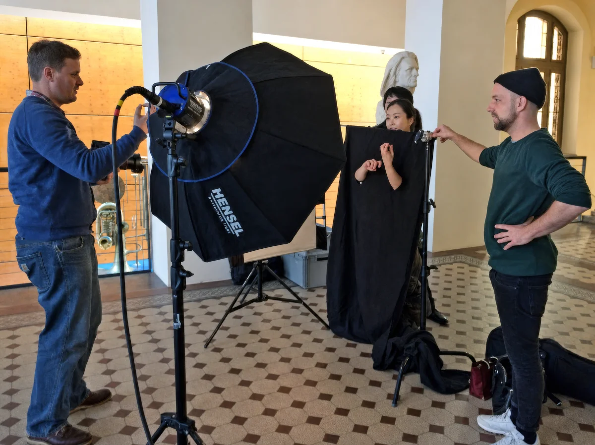
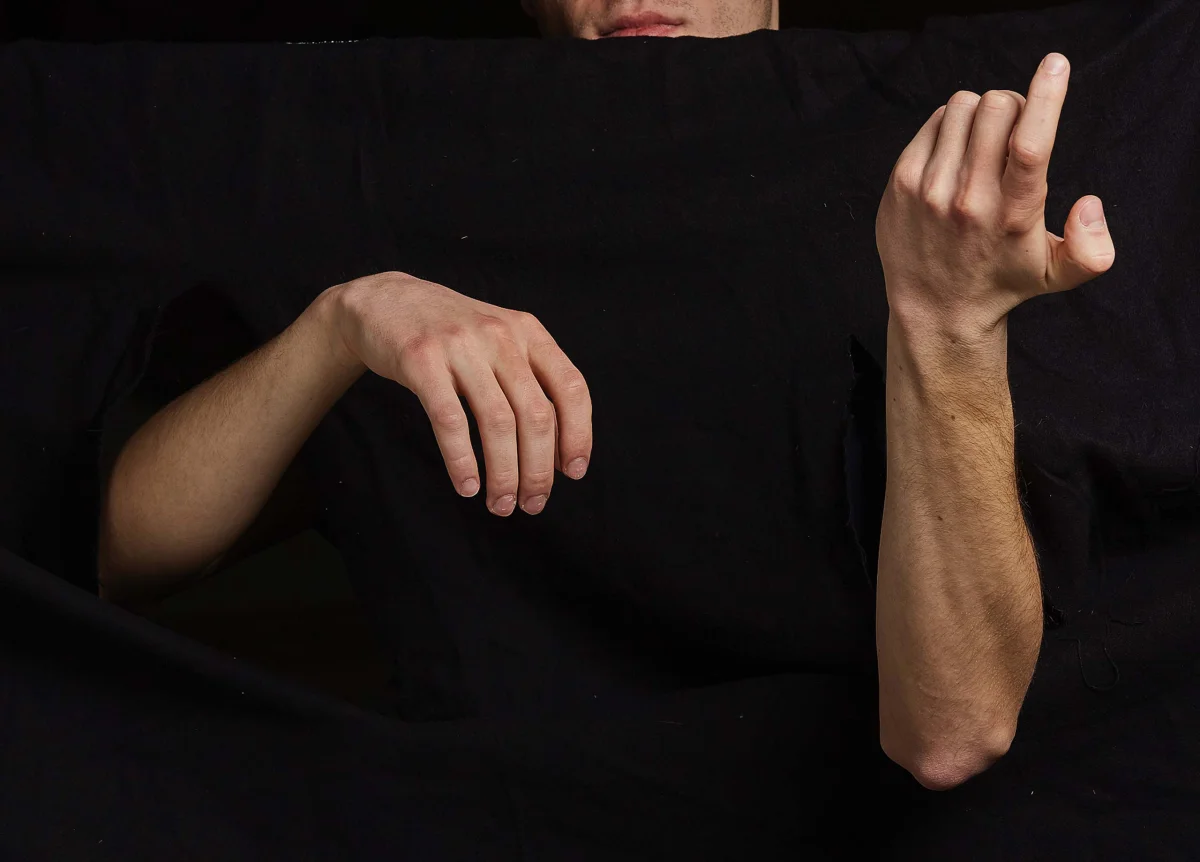
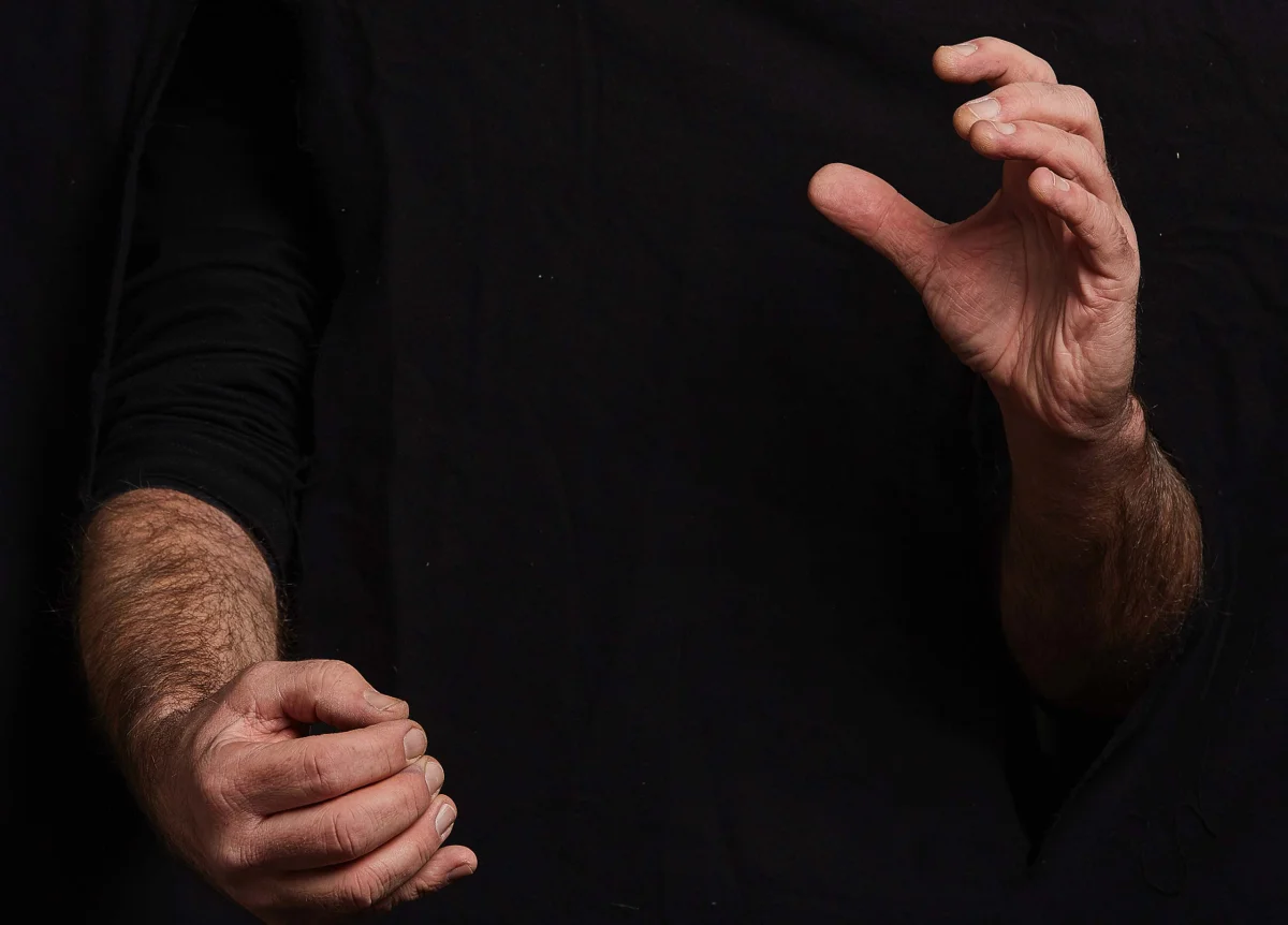
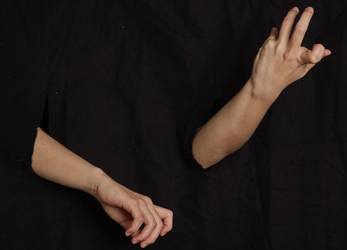
Biennale photo shoot with studio lighting and black fabric framing a person’s hands posed as if playing an instrument.
Two hands against black fabric, one hanging loosely and the other raised with curved fingers.
Close-up of two hands against black fabric, forming different fingering and playing gestures.
Arms and hands against black fabric, with one hand raised and the other pointing down with curved fingers.
Sequence of letter A forms gradually changing slant between plus and minus 60 degrees.
Biennale type specimen with white letters, numbers and symbols on black; repeated A forms create a rhythmic sequence.
Large white B from the Biennale typeface, contrasting thin and thick strokes.
Two white T forms with thin stems and broad, tapered top serifs.
Enlarged crop of a white R showing its curved bowl and diagonal leg.
White I and J letterforms with fine serifs and a rounded terminal on the J.
White “Strijkkwartet Biënnale Amsterdam” lettering on black, incorporating a sequence of differently slanted A forms.
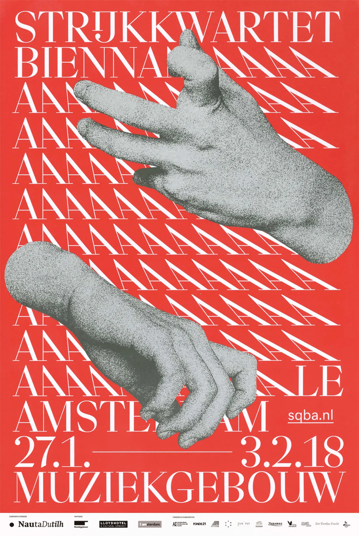
Red Biennale poster with rows of white lettering and two cut-out hands forming playing gestures.
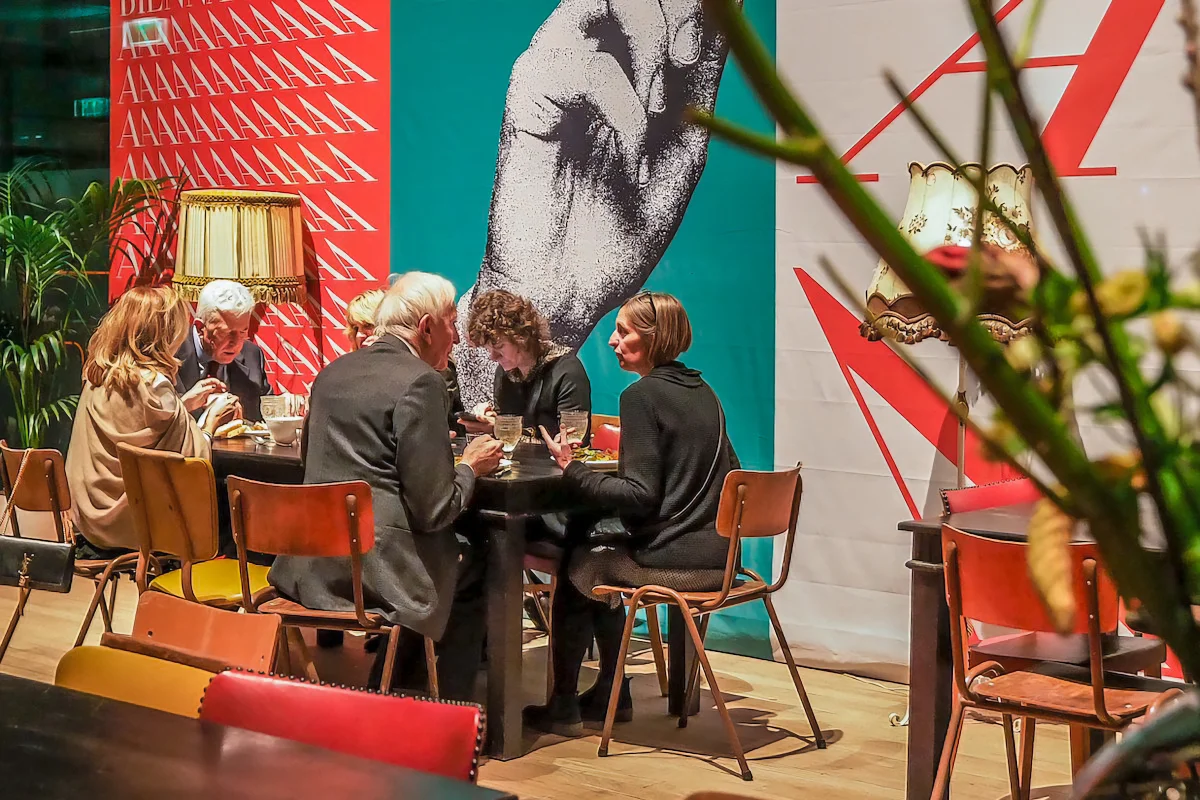
Festival visitors seated at a table in front of large posters with hand imagery and expressive typography.
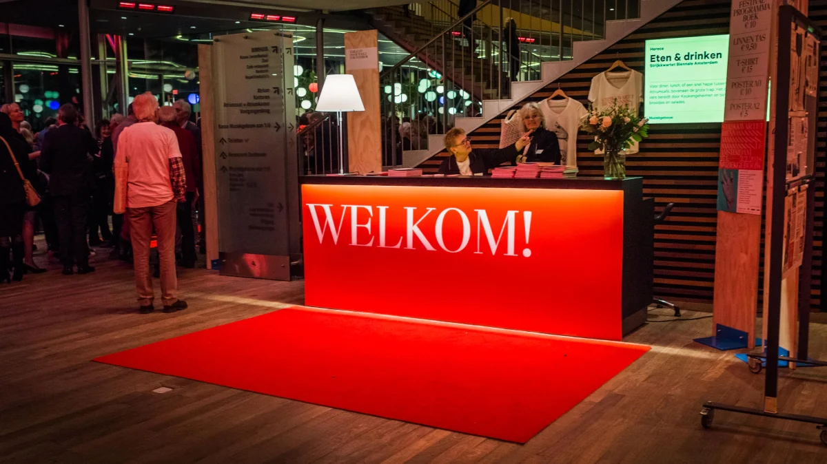
Red reception counter with white “Welkom!” lettering and a red carpet in the festival foyer.
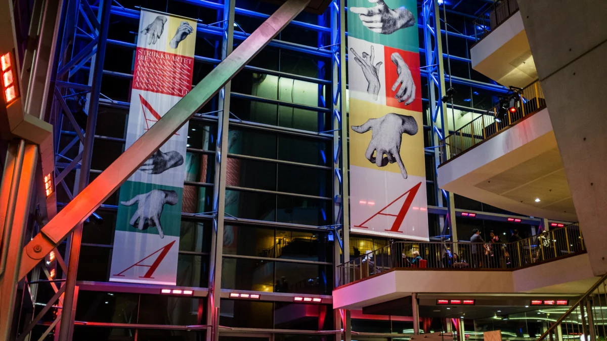
Tall banners with hand imagery and coloured lettering hanging across several storeys of the festival venue.
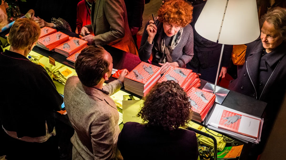
People at a sales table with stacks of red Biennale programmes and other printed materials.
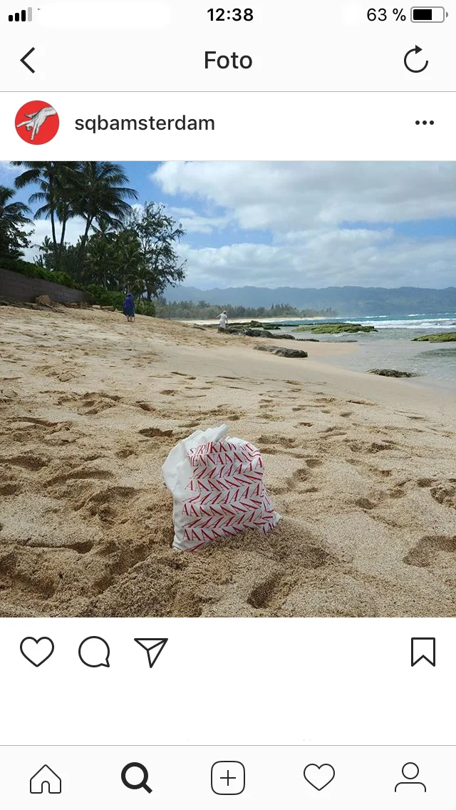
Instagram post showing a paper object printed with typography on a sandy beach.
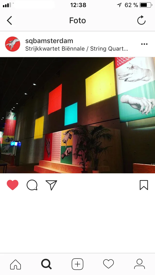
Instagram post showing coloured wall panels and Biennale posters inside the venue.
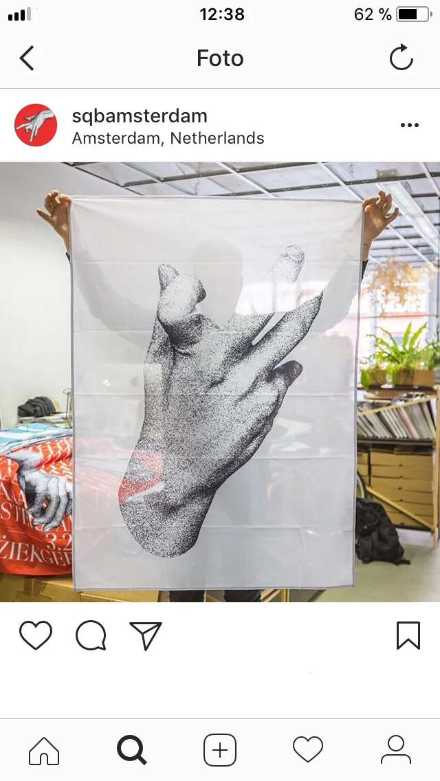
Instagram post showing a white fabric banner held up with a large black-and-white hand image.
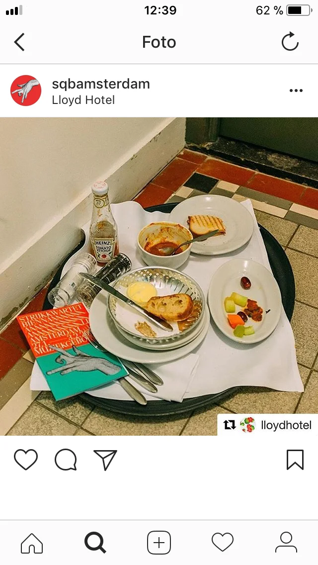
Instagram post showing a breakfast tray with small red and turquoise Biennale printed items.
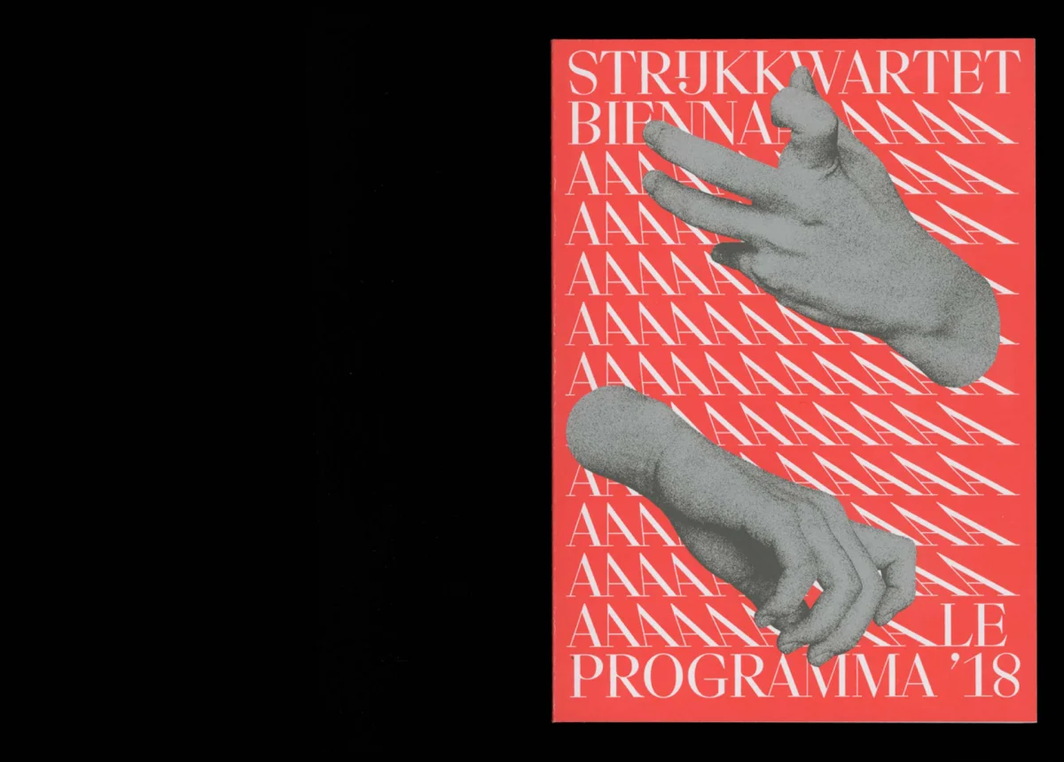
Red Biennale programme with rows of white lettering, two hand images and the title “Programma ’18”.
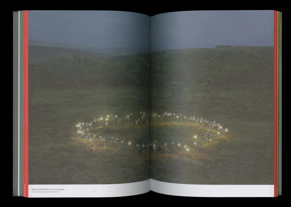
Programme spread featuring a landscape photograph with a ring of white flowers in the grass.
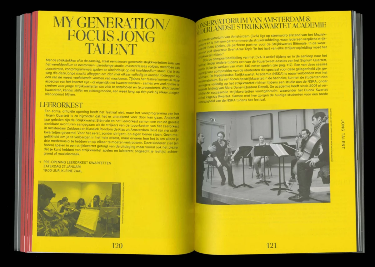
Yellow programme spread with large headings, narrow text columns and photographs of string ensembles.
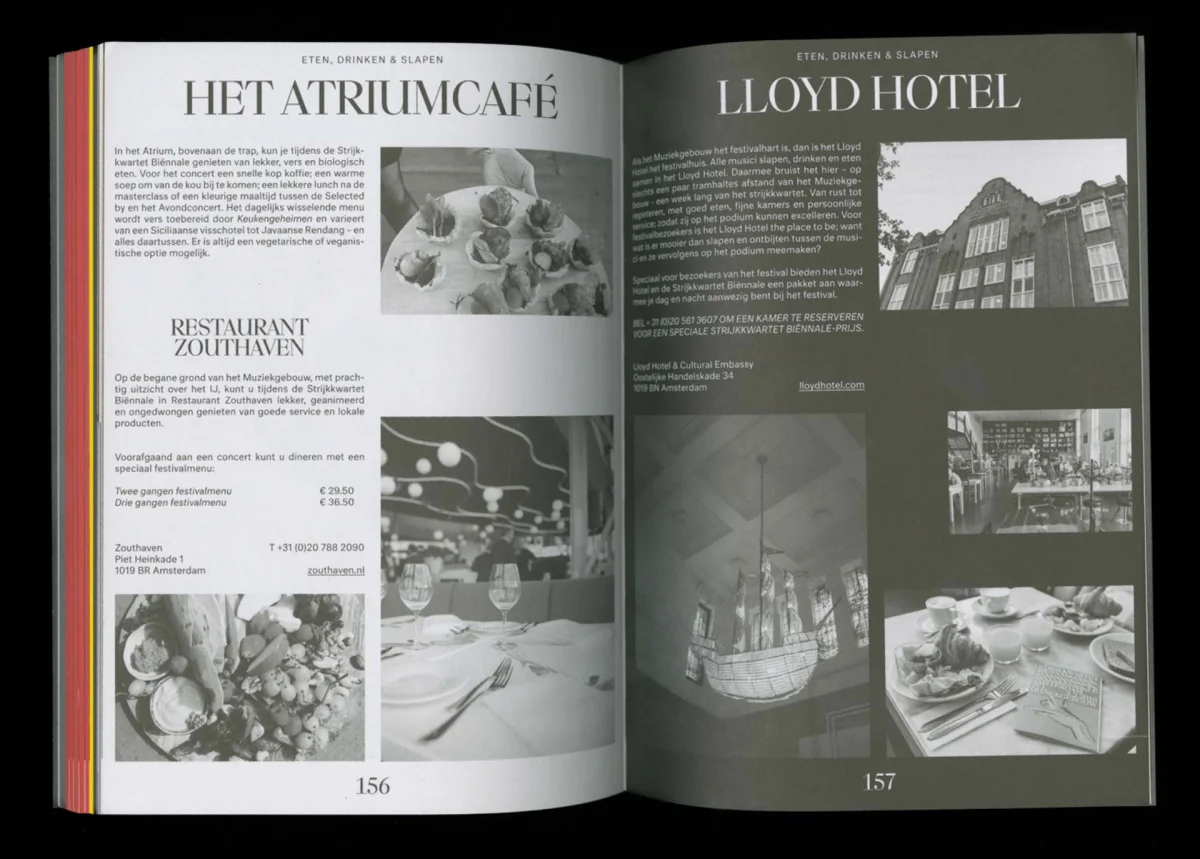
Programme spread about “Het Atriumcafé” and “Lloyd Hotel”, with black-and-white photographs and multi-column text.
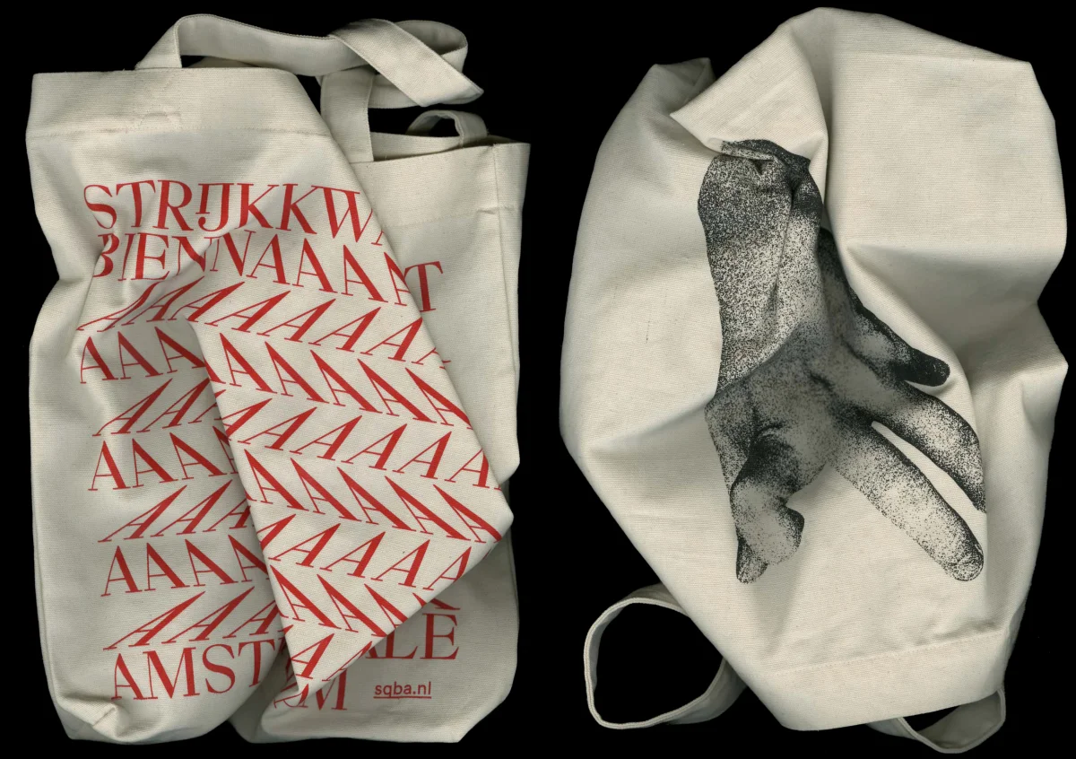
Two cream-coloured tote bags, one printed with red Biennale typography and the other with a black hand image.
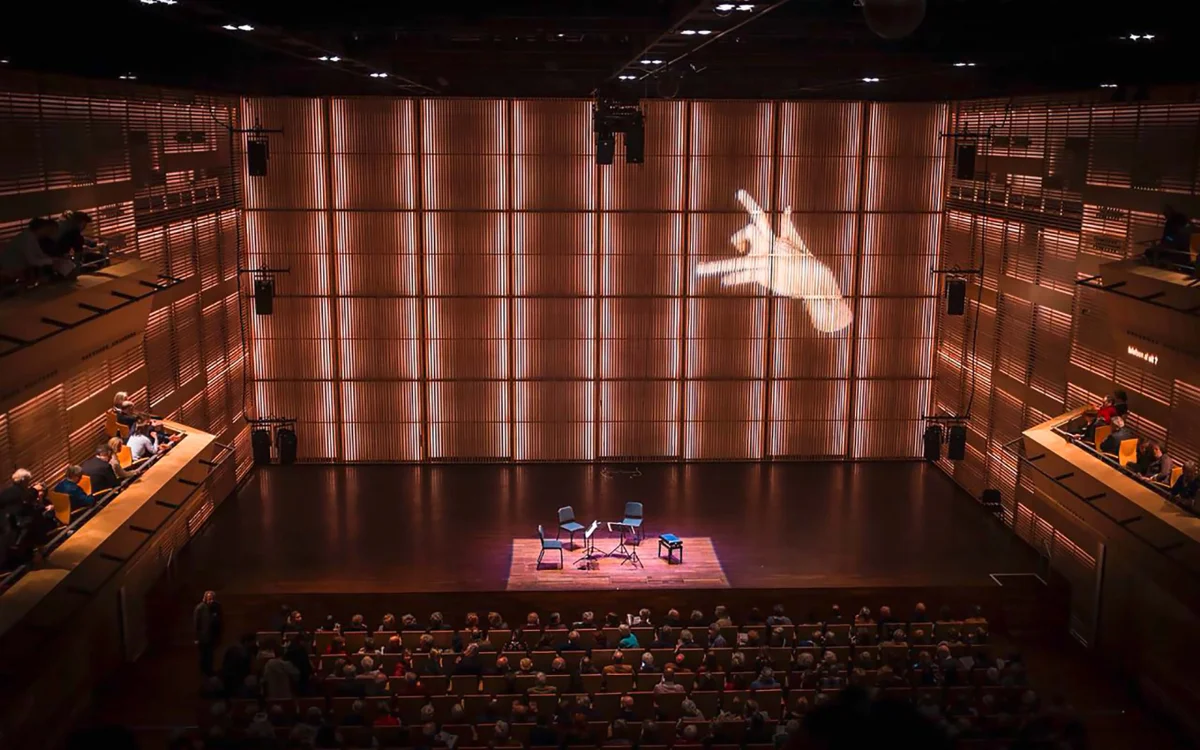
Concert hall with an audience and stage, with a hand image projected onto the large rear wall.

Project

Project Title
String Quartet Biennale Amsterdam
Client
Stichting Strijkkwartet Biënnale Amsterdam
Year
2018
Services
Identity Design, Campaign Design, Type Design
Role
Concept Development, Art Direction, Type Design
Project Lead
Markus Lange
Graphic Design
Markus Lange, Pawel Wolowitsch
Photography
Marco Warmuth
Animation
Patrik Bablo
Location
Muziekgebouw Amsterdam, Amsterdam
Typefaces
Strijk by Pawel Wolowitsch
Neutral by Typotheque